Building AMP Stories in WordPress
A few months ago our team at XWP was tasked with the challenge of building AMP Stories in WordPress. We began working with the team at Google to come up with an initial minimum viable product.
Following are some of my messy sketches showing our process and what it took to move from the initial idea to a released product. I find sharing the process is as important as the final product as it shows the thought and deliberation that went into it, and helps open up discussions for further improvements.
The project
We didn’t have an unlimited period of time to work on it, so we knew we’d have to work quickly to try out some ideas and create a shippable beta for sharing with users and stakeholders.
AMP Stories are a mobile format for sharing articles and content in a tappable way. They're similar to how Instagram Stories function. The idea with bringing this format to WordPress is anyone using the AMP for WordPress plugin would be able to create their own stories without needing to code a custom solution.
At the start of the project it made the most sense to build the interface for AMP Stories using Gutenberg, a soon-to-be-released editor for WordPress. This gave us the opportunity to work with a new editor and pave the way for experiences that could improve Gutenberg as a whole.
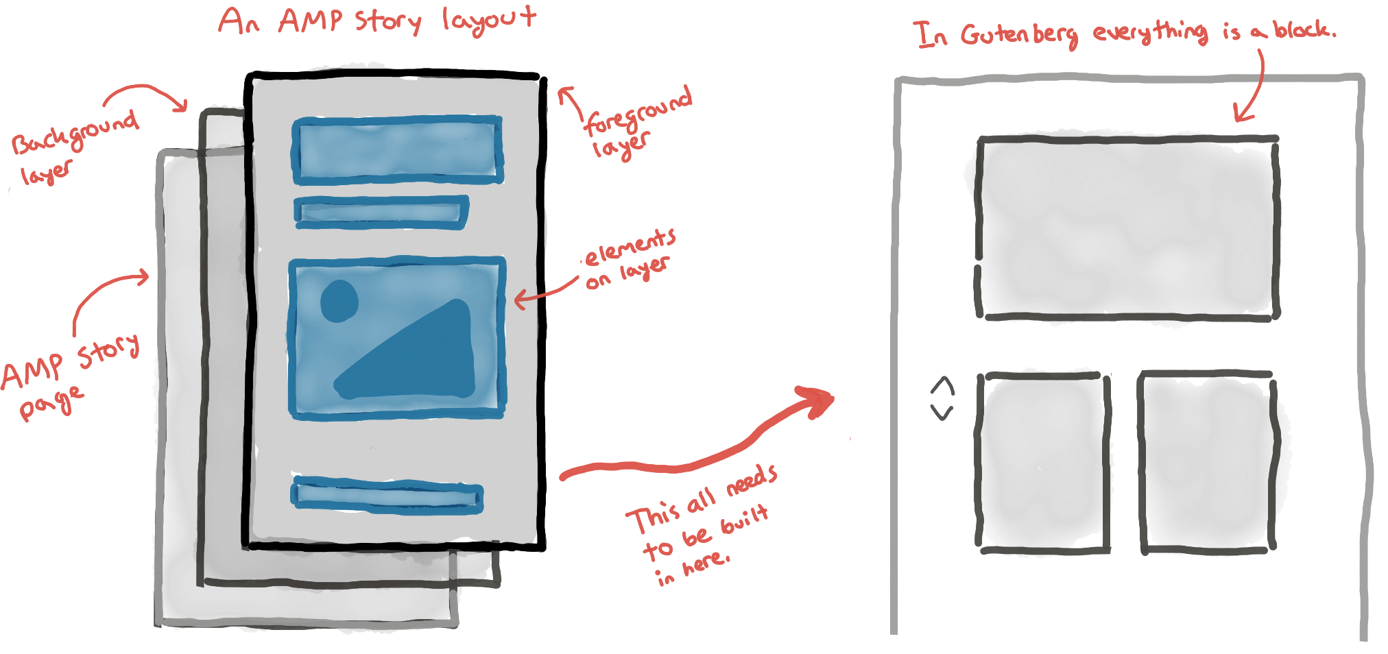
My role on the project was to design the user experience. I worked closely with several of our team as we all brainstormed and looked at ways to make this happen. The initial problem was around AMP Stories themselves. At its most basic an AMP Story has several parts to it:
- A bunch of pages
- Layers inside each page
- Elements inside each layer
An AMP Story can be as few as one page, and could easily number 10-50 pages. We needed to somehow match that to the block interface in Gutenberg.
Initially this felt right, like it should work. However, we weren't quite sure how easy it would be for someone to build a story using this editor. We also didn't want to introduce unnecessary complications for users.
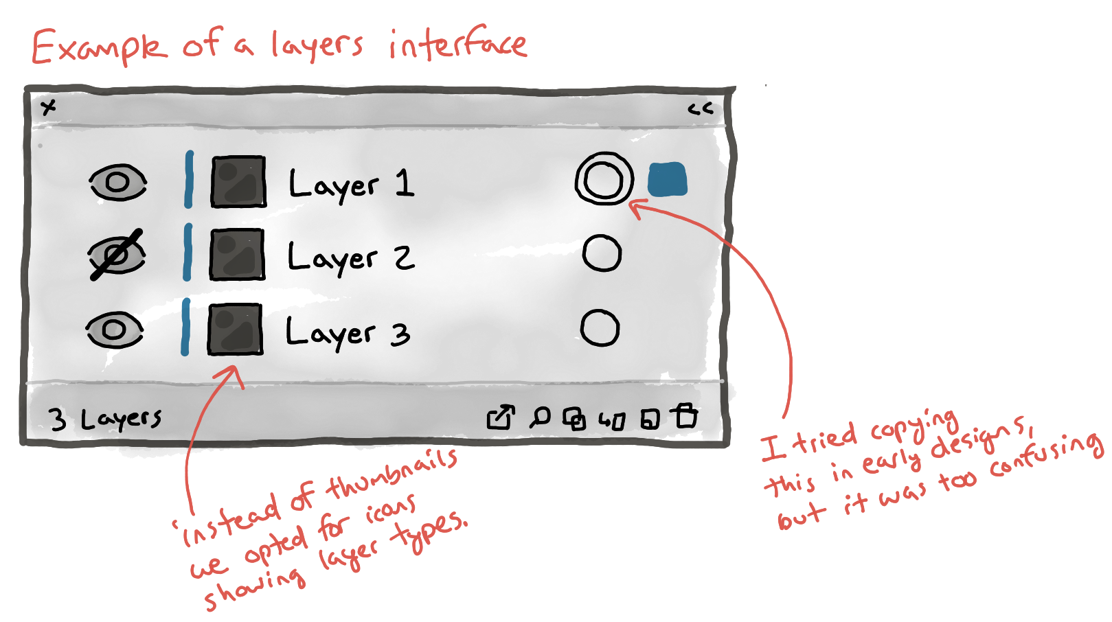
If you’ve ever used a program that has layers built in, such as Adobe Photoshop or Sketch, you’ll be familiar with the concept of hiding and showing layers in a way that allows you to manipulate content. Below is a sketch showing the elements that might normally be shown in a layers palette.
We knew we'd need to make sure it wasn't too complicated to edit pieces of one layer without overwhelming users with things on other layers.
With this idea of trying to match all the parts of an AMP Story to the available parts in WordPress, I began sketching ideas for the interface in collaboration with the rest of our team. Products like this often require lots of iteration before we can settle on a solution.
So, I tried out a bunch of ideas.
The process
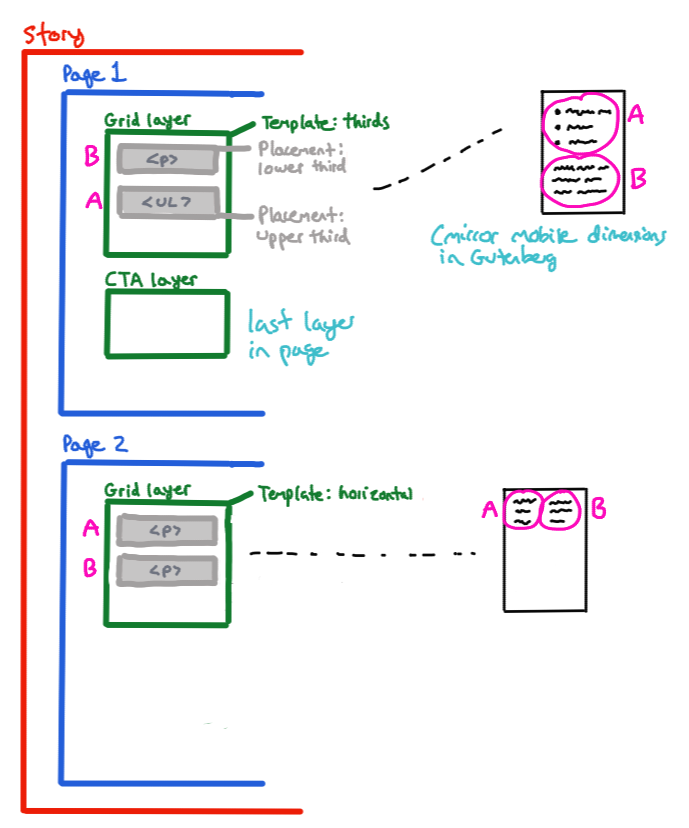
If you follow the initial conversation on Github, you'll see that we started by wrestling with the concept of the story, the pages within the story, the layers, and elements in the layers. This first sketch, color coded accordingly, attempts to figure out what that interface could look like.
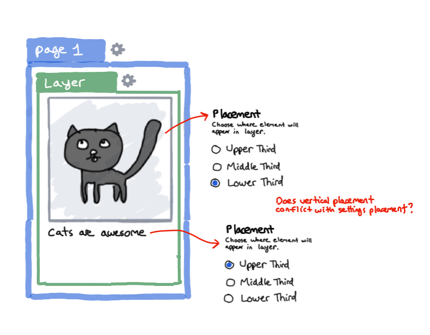
And here is another sketch thinking through that concept further. Please note that for the sake of brevity I'm skipping a few things.
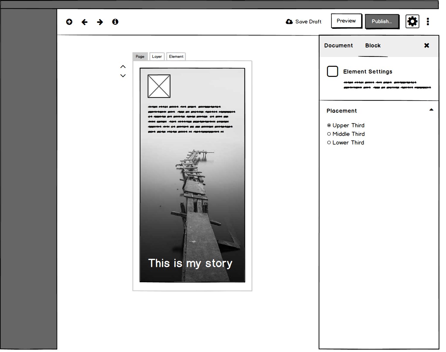
From the first few sketches and ensuing conversations I was feeling like I had figured out the problem, and was itching to go from simple sketches into a more complete design (using Balsamiq wireframes).
As I've shared before, this is ok to do, but be cautious! The moment you go from a simple form of visual sketching into something that's more detailed there's some risk. This is called going from low fidelity to medium fidelity (and then eventually to high fidelity). The problem is you'll sometimes get so stuck in something you've spent hours building that it's hard to scrap it if things are going wrong.
I was thinking that the layers and blocks could fit into a tab interface right on top of the story. That sounded right in principle, but in reality it didn't make sense when I shared it with the team.
I tried some other ideas, and we also agreed that pages shouldn't be in a tab, instead they should just go down the page as linear blocks; reducing one extra user element, that's good!
Well, after chatting with the team we realized this wouldn't make sense, it was still too complex. I even created a bunch of screens and showed a video walkthrough of the user journey. It wasn't working. So I went back to simple sketches again.
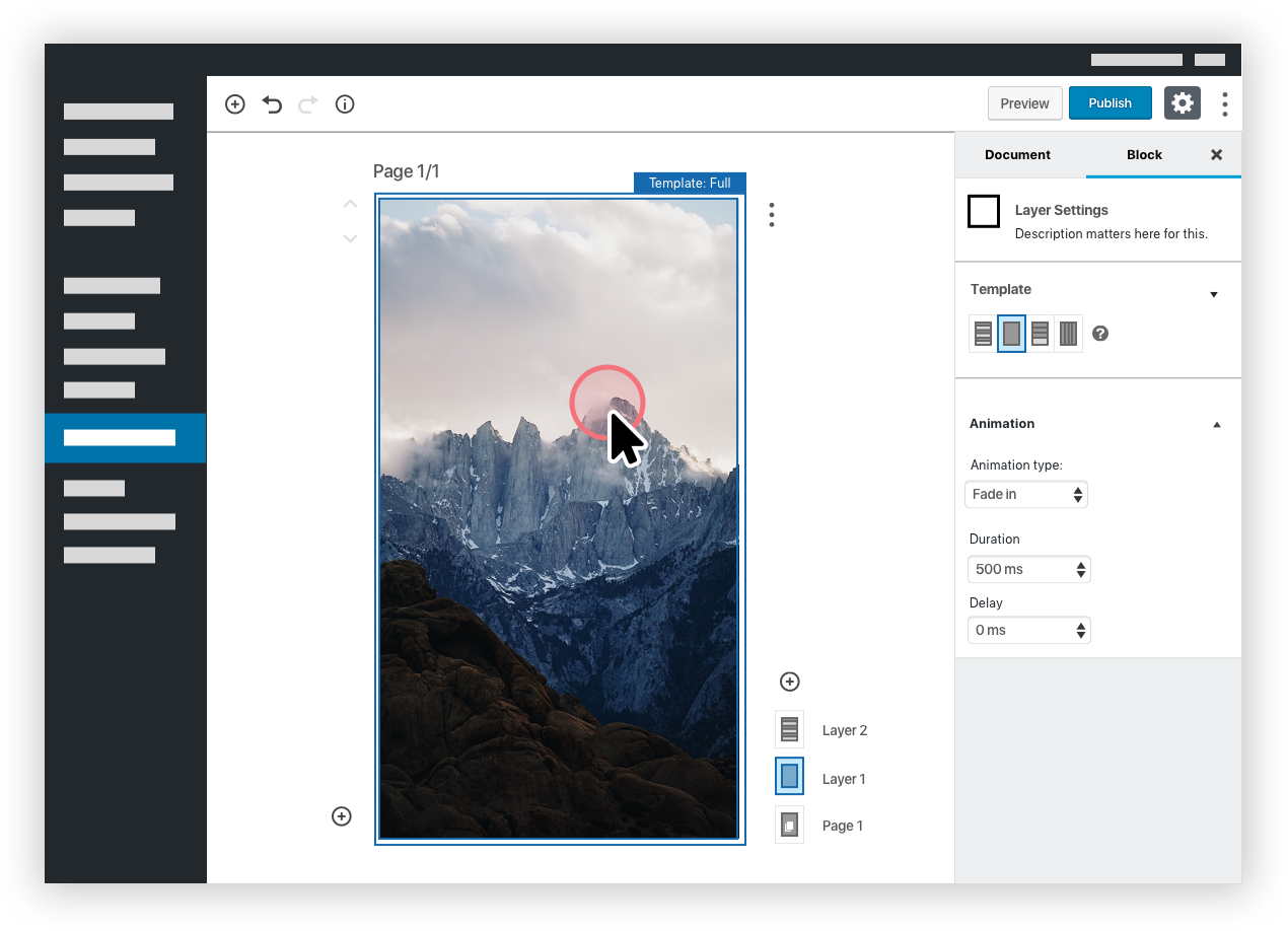
This is where we landed on a concept that made it into the final product. We knew we wanted a way for users to be able to select different layers and elements, and knew it'd be important to make that visually simple, so we added small layer cards next to each page. Viola!
We had further discussions to make sure we were on the right page, and decided we were headed in the right direction.
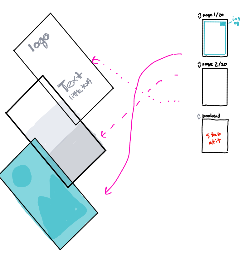
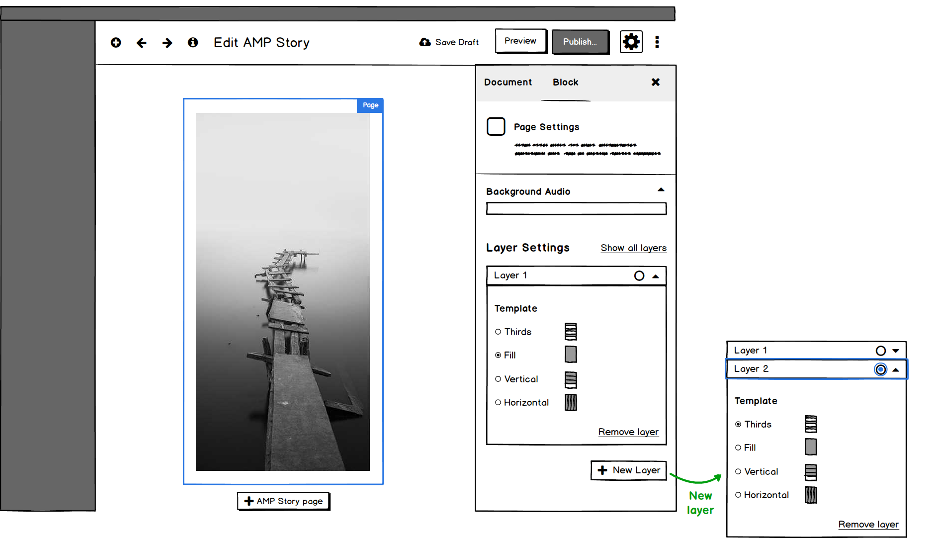
We started getting the idea of the layer cards a little bit more fleshed out. One design element I hoped to simplify with the card icons was the types of layers. Since a page can have several different layer types (fill, thirds, vertical, horizontal) I wanted to create different icons for each one.
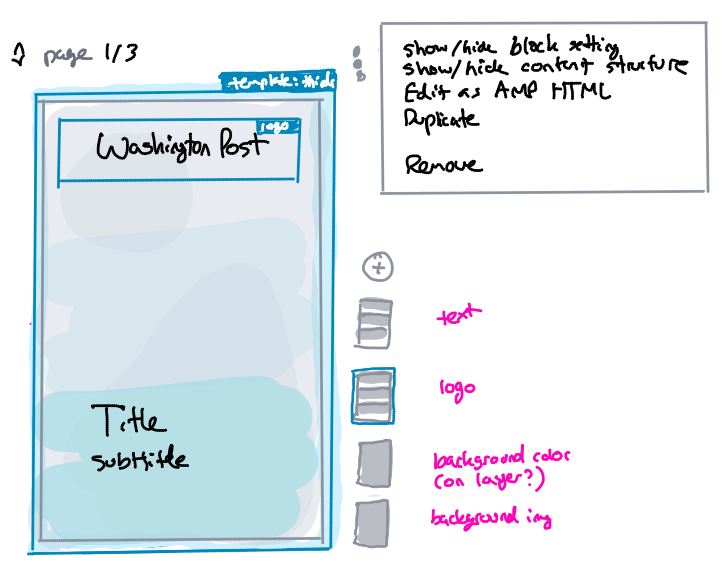
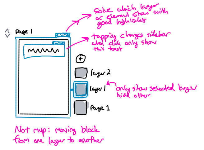
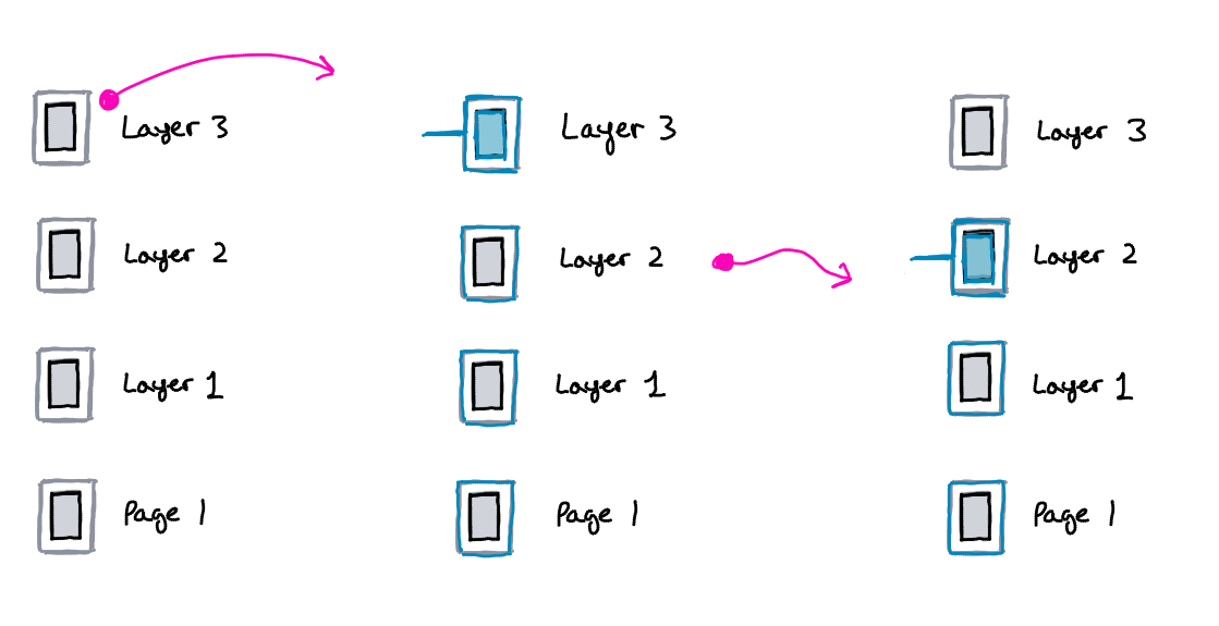
At one point we had a discussion to make sure the selectability of the layer cards made sense. I sketched out the various selected states. Our idea was that if a bottom layer was selected all layers and elements above that layer should be hidden, to allow for easier editing.
That was a good idea, but we needed to make sure the layer cards helped with showing which layer was active.
We finally landed on an idea that felt right, didn't get overly complex, and was worth building out for real world testing.
I then took the rough sketches and created a prototype and user journey for creating a basic AMP story.

From there our team was able to develop this into a beta feature for the WordPress for AMP plugin with Gutenberg as the platform. You can also view a clickable prototype of the work in Adobe XD.
Conclusion
This was a wonderful project to work on. The team was great to work with and we created a useful MVP within a short period of time. The work was built using our own expertise, best practices in UX in WordPress, as well as feedback from a handful of folks.
Projects like this are always challenging and fun and offer opportunity to figure out the best thing to build with as simple of a user experience as possible.
If you're curious and want to try it out you can download the latest version, keep an eye on XWP's blog for an updated post.