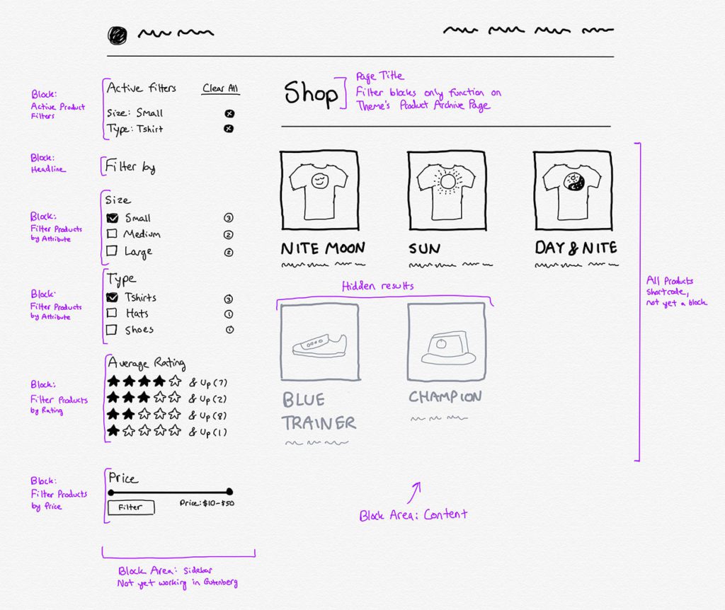
The above sketch is from my work on the product filter blocks for WooCommerce.
For the past three months I’ve been working at Automattic as a Product Designer with the WooCommerce team. The first few weeks were Support Rotation, followed by onboarding, and then jumping into some smaller projects and attending a few meetups.
Right now we’re working on converting existing widgets in WooCommerce to blocks for Gutenberg. This process has been a fun one where I’ve been able to look at ways to improve the blocks in a Gutenberg context, and also get a better understanding of how stores work.
Among many other things, one of the joys of my job is that I work on open source software. Because of that I intend to share a lot of what I’m working on, and the process I go through. We’ll call this my journey to a deeper understanding of what it means to be a Product Designer.
If you have any questions about my journey in this field, feel free to reach out to joshua@joshuawold.com. It may be the inspiration for a followup post.
Over the years I’ve had various motivations for writing on this site. Recently the main reason has been because I have something I want to get out of my system.
Writing can be for others to read, but it can also be for me to process how I’m thinking about something.
So, I’ve begun writing about things that interest me and that I want to formulate into something that’s a bit more structured than fleeting thoughts. It’s a good medium to practice in without much pressure. I don’t know who reads this, and don’t have tracking or comments turned on. Every few months someone tells me they enjoyed an article. And that’s about it. I love it.
if you have questions about something I’ve written on, feel free to email me: joshua@joshuawold.com. I’d be happy to discuss, and it might inspire me to push out another article.
As a post-apocalyptic story, this film explores themes that dig into what it means to be human, and how humanity affects the world around us; all this against a backdrop that isn’t the exact world we live in, but something similar.
I Am Mother begins with a brief text description of an event that has ended humanity, and you soon learn that it’s not safe for anyone to exist outside. I took this at face value, but realized later that, while technically correct, the spirit of what it intended was deceitful. This is a theme that continues throughout the movie.
Mother, a droid, raises a little girl from an embryo to adulthood, and trains her in the ideals of humanity. We later see that this girl, called Daughter, is what Mother considers to be an exceptional human, testing at the top of the charts in all of her scores. The intent for Daughter is to be an example for others to follow as the world is repopulated. Daughter is raised in a secure indoor vault, with all of the resources needed to sustain life. With her are 65,000 embryos kept in cold storage. This vault is the backdrop for most of the movie, and its tight spaces and stark mechanical walls and locks provide tension to the scenes.
The beginning scenes of raising Daughter hit close to home for me. I have two small children, and movies with sensitive themes centered around children affect me more deeply than they used to.
As daughter grows, the droid cares for her in a manner which could be interpreted as sentient and loving, or programmed and and indifferent. In the beginning of the movie I leaned towards caring, but the backdrop of the film, in the vault, didn’t make it feel like a home. If you’re unsure about watching, I highly recommend the film. The ending left me with questions, but I felt it was still satisfying.
Spoilers ahead.
In the beginning of the film Mother starts the process of taking the frozen embryo out of storage and placing it in a large glass sphere filled with liquid, representing an artificial womb. As she does this you see a countdown clock for 24 hours. This rapid process helps the embryo to reach full gestation in a day. As this happens text on the screen appears and indicates how much time has passed since the apocalypse event.
Some quick math helped me quickly realize that something was off. When we finally see Daughter fully grown, she’s a young woman, but not anywhere close to the age needed for the 13,000+ days that have passed. I did a check on the actor’s age to make sure I was right, and realized over 35 years had passed since the apocalypse. This woman we seen grown up is much younger. This intention clue set up tension in the movie as I tried to figure out the 10+ missing years might have gone.
Daughter wasn’t the first child to be raised. Mother had two children before this, but aborted both in a furnace because their early scores weren’t satisfactory. This is not shown, but Daughter finds evidence much later of what happened.
As the film progresses, another woman appears at the entrance of the vault, and has a story of being wounded from other droids. Daughter lets her in secretly, and helps her recover from a gunshot wound when the secret is discovered. As the film progresses the viewer tries to figure out what part of this stranger’s story is true, and where Mother fits into the whole picture. Slowly we realize that bother Mother and this stranger use truth and deception to their own advantage.
At the end of the movie Daughter convinces Mother to let her raise her newly born brother, and allows herself to be killed. Because the Droid has a mind that exists in other machines, she uses another body to kill the stranger. The last few minutes left me thinking about its themes and how the movie would continue past the end credits. Daughter is alive and allowed to raise her siblings.
I wonder why Mother killed the stranger, and why she was allowed to live all this time. I also wonder about Daughter’s motivations, as the ending implies she will take the place of Mother in raising humanity, and may follow the ethical path set out for her from birth. However, as a human she still retains her humanity, so what type of world will she create? Will she be kind and caring to all, or will she also follow the themes impressed on her from childhood that some humans are better than others.
The videography throughout is stunning. Many scenes could be a still photo. Dialogue is efficient when used, and imagery conveys the story as much as talking. In one scene a woman holds an axe and walks through steel doors, reminiscent of the 1984 Apple ad. In another two people walk through deserted landscapes, reminding me of scenes from Interstellar, traveling through another world. As we contrast scenes inside and outside the vault, we see how life and machines have existed, and how one side won long ago. Humanity is supported by the machines it has created, but these machines decided to only elevate the parts of humanity they deem acceptable.
I absolutely recommend this movie. The story is well done, and all three actors (including the voice for Mother) deliver exceptional performances.
I’m too closely intwined with my digital life. I have a problem. At times it holds my attention more than my real life, and some days it’s hard to tell the two apart.
Technology has been wonderful for me. As a teenager, with unknown prospects for where I could take my life and career, technology opened doors for me. It’s been a force for good in my life, and because of that I’ve started to believe any new iteration of technology must be good.
As a young teenager I worked an entire Summer in the scorching heat of Arizona to save up enough money for my first laptop, costing roughly $1,500. Around that time I started to realize that computers weren’t just for gaming or instant messaging, I could also be creative. At that time a battle between my ability to create versus consume began. This was in 2001.
It all started with graphic design. I realized I could take my love of drawing into a digital medium and create things online. And, people would pay me for it.
Years later I added fancier devices: an iPhone and iPad, and had a full arsenal of software and hardware available to pursue creativity. But along the way the battle for creativity versus consumption picked up.
The first problem I faced was gaming. From ages 9-13 I was deeply absorbed in any game I could get my hand on. Entire months disappeared into fantasy worlds. Cracks in this cycle began when I realized I could be creative and earn some money with it.
For a few years things went in a more positive direction, I mostly ignored the consumption side of computer use, and technology became a tool primarily for career growth.
Then, slowly consumption crept back in. Digg, Reddit, Facebook, Instagram, LinkedIn, Gmail, Slack, all of my favorite tech and news sites, and more. Then, when I got my hands on an iPod Touch (and later an iPhone in 2012), the floodgates really opened up. Any information or entertainment I wanted was available to me, right at my the touch of a finger.
I successfully fought against most of it some of the time, especially since had personal and career interests that were more important. However, in all the spare moments between things, or when I felt that I was fighting too hard against learning something, the temptation to take a break and pull at the infinity pool in my phone became too strong.
Other than a few rare respites, my quiet times disappeared. At 31 years old, I’m right at the edge of a generation that remembers life before and after connected technology. I remember times of boredom and play away for screens.
I’ve tried a dozen ways to curb my internet and consumption use. I’ve tried life hacks, minimalism, and sheer force of will. Some days I win, and other days it’s too much to ignore the siren calls beckoning me.
With all of that context I tried something last month. I picked up a new book from Cal Newport called Digital Minimalism. I’m a huge fan of his work. His blog and previous books have inspired me in career decisions, as well as how I’ve used social media.
In 2016, inspired by Deep Work, I quit social media for 30 days. When I came back I realized how little I actually needed any of it. I have since eliminated my usage of social media by about 80%. My trick there has been to unsubscribe and unfollow everyone on all my accounts. It’s made social media mostly boring. However, I still go on to try and find a dopamine hit throughout the day. A decade of habits is hard to break, but I’ve gotten close.
When I saw a new book by Cal Newport, I knew I needed to read it, but hesitated for a few months. I was worried it would hit me over the head with guilt about the way I was too absorbed by consumptive technology. But I was wrong. It was a genuine and heartfelt guide to inspire all of us to live a better way. It offered encouragement and directions for how I could fight back against the tide.
In the middle of reading the book I decided it was time to spent 30 days disconnecting from the sources of mindless input I’ve grown accustomed to using. When I did this in 2016 I eliminated social media, now I wanted to include almost everything else.
At the same time. I was reading Make Time, a book by Jake Knapp and John Zeratsky. It describes a specific category of activities as infinity pools.
Infinity Pools are apps and other sources of endlessly replenishing content. If you can pull to refresh, it’s an Infinity Pool. If it streams, it’s an Infinity Pool. This always-available, always-new entertainment is your reward for the exhaustion of constant busyness.
This concept resonated with me. I have a lot of infinity pools. Even if the content they offer isn’t great, it’s still comforting to gaze in and try to get a dopamine hit. So, anything with a pull to refresh lever can count.
So, I knew I needed to try something. I also didn’t want to eliminate actual hardware devices, not yet at least. I wanted to see if there was another way.
For the past 11 years or so, I’ve willingly accepted most forms of technology into my life. Whether it’s entertainment, productivity, or learning, I’ve had a habit of trying it all. Now, because of my own attempts at simplifying my life, I’ve been able to successfully moderate a number of these sources of content.
However, I’m a single imperfect person fighting against consumption designed by some of the brightest minds in the world. Trying to hack my way through using these streams of data is a losing battle.
I may try to curb my social media use, cut down on news intake, and limit my time playing games and streaming TV. But it’s not enough. I can resist a few hours or days at a time, but I eventually go back.
So, when I heard about a plan from Cal Newport, I was inspired to try it.
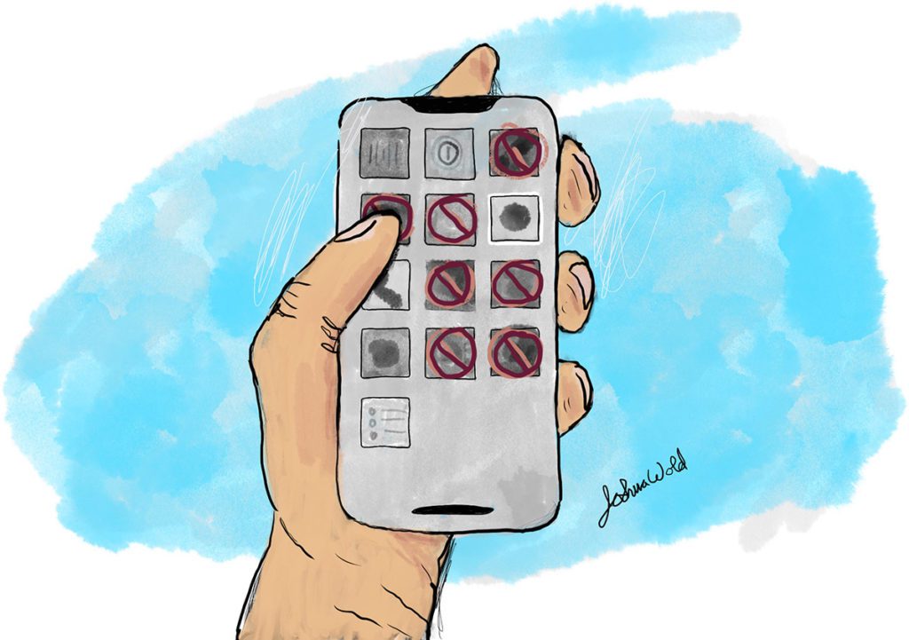
The basic plan is to eliminate all consumption for 30 days. If it’s not critical to maintain relationships or your career, cut it out. There can be exceptions for specific cases, but on the whole this means no social media, no digital gaming, no tv or movies, and no content sites.
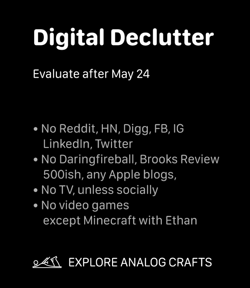
So, I wrote my list of things I’d eliminate for 30 days.
I then created a wallpaper and set it as a background on my phone and laptop. To further enforce the habit I blocked all of the domains on my devices.
Here’s the list:
So, how did it go?
For the first two days I felt jittery. I kept pulling out my iPhone to check Instagram, look at Reddit, or read one of my favorite blogs. I even typed the urls to my favorite sites multiple times without realizing what I was doing. It was only when I’d see a blocked site notice that I’d remember my detox plan.
After the first few days I settled into a few new routines. Because most of the sites I would normally visit were off limits, I used a lot of downtime for reading books, listening to podcasts, etc.
At night time, I went to bed roughly an hour earlier than I normally would, since reading a book isn’t nearly as stimulating as watching a movie or browsing Instagram.
In summary it was absolutely a good thing.
I’m now given it some thought for how I can make lasting changes.
As I’m writing this, I logged back into most of the sites I’d blocked, since we’re right on the 30 day mark.
On all of my social media accounts I only found two messages that were folks reaching out. I dropped a quick response back to both, but neither was urgent. On my favorite tech blogs I read through the last month of articles, and realized I hadn’t missed anything important.
Overall this detox was tremendously valuable for me. I still wasted some time on refreshing email and visiting sites that were useless (for example, box office results for Avengers: Endgame), but on the whole this detox gave me control of my time again.
The biggest takeaway is that I don’t need most of the sites I blocked, and I need to find better ways to use my time on the whole. We’ll see how that goes.
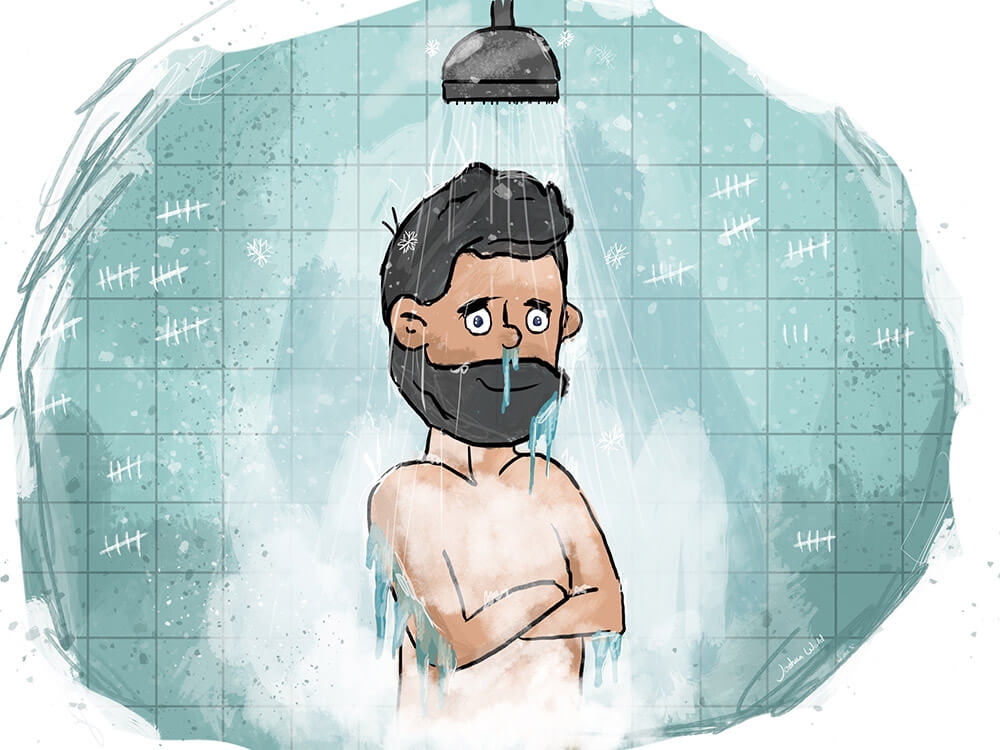
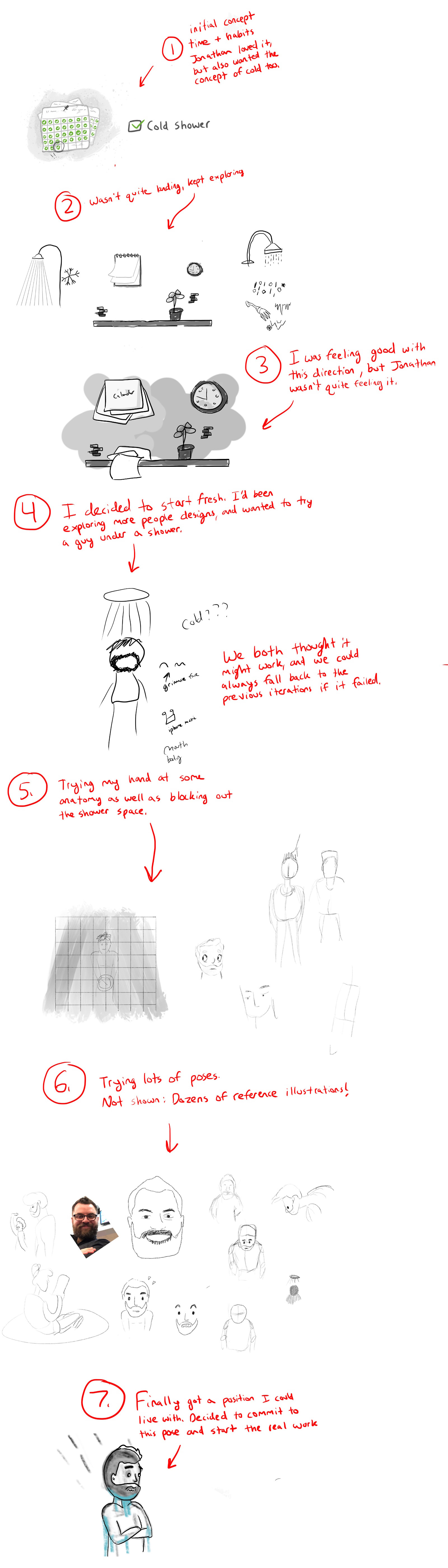
Recently I did an illustration for Jonathan Wold for an article he wrote on his site. In this post I wanted to share a bit of the process, and hopefully inspire others with how messy it can be to get from the beginning to the end.
We’ve worked together quite a bit in the past (we’re brothers after all), and we both know how to trust each other to get from an initial idea to the end result. Often Jonathan comes up with the idea for an illustration he wants, and then we have an initial chat about it. From there I try a few things out, and then I’ll text them over for feedback.
At that point he gives thoughts on what he likes and doesn’t, and I’ll keep tweaking. The key factor though, is at any point I’m welcome to disagree with his assessment and push in a different direction. In fact I do that often, maybe half of the time. He trusts that the end results will work out, and prefers instead to give general guidance, but not to push too hard in any direction. Because of that I try not to get too attached to any one idea until I take it from sketches to full on illustration.
First, here’s the final image:
And here’s the most of the steps to accomplish that:
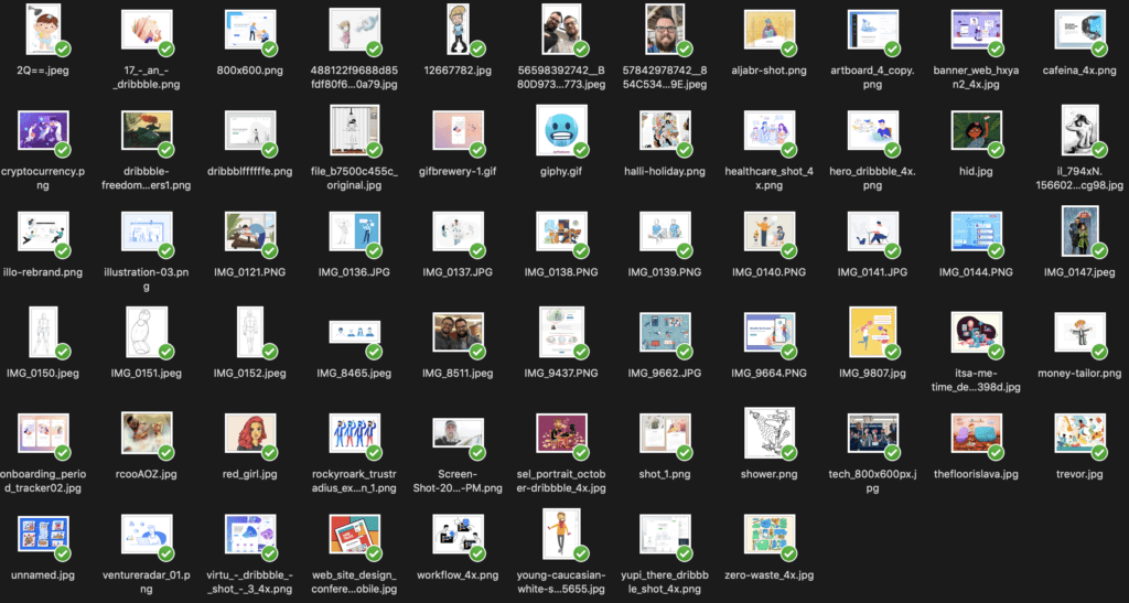
And here are some of the reference images I was using throughout the process. To show that all design is inspired by others.
And finally, thanks to Procreate I can share a video of the final step. Hope you enjoy!
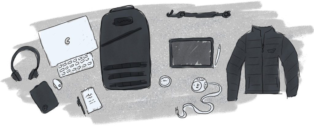
If I’m working at a coffee shop for the day (I like to do that 1-2 days/week, even though I work from home), or if I’m on a trip, I’ll likely bring some combination of the following.
Backpack – My current favorite is the Bullet Ruck 15L. It fits a 15″ laptop quite comfortably, and since I carry my laptop in a sleeve I’m not as worried about it getting scratched up or bumped around.
Laptop – 15″ 2018 MacBook Pro with a leather sleeve. I debated between the 13″ and 15″, but ultimately decided a more powerful computer and a larger screen would be a good thing, especially for more eyes. I’ve started getting tired of staring at small screens. So far (and it’s still quite new) I haven’t had any problems with the keyboard.
Stand – For the past few years I’ve been using the Roost Laptop Stand. And, while it looks a bit funny, I’ve found it incredibly useful and compact. It helps me use my laptop with a mouse, and elevates it to where I’m not staring down at the table while I’m typing.
Mouse – I use the Apple Magic Mouse 2 with side bumpers from elevation lab. It helps make the mouse feel a bit more wide in the hand, and might make it more ergonomic.
Keyboard – Currently using the Magic Keyboard, I like that it has an on/off toggle finally! I can disable it in my backpack so it doesn’t try typing away on my laptop.
Mousepad – I have a leather one I picked up a while back, and love it. I’ve started using this less and less, but sometimes I find the tables at coffee shops can feel sticky, and in those cases having a mousepad is a good thing.
Power – Right now I have a bit of a problem. My iPad and laptop use USB-C for power, my phone uses Lightning, and my headphones use Micro USB. The way I solve this is by bringing 2-3 cords at a time, as well as power bricks. I also carry a small phone charger with a lightning cable built in. I also carry this power strip along wherever I go. It functions as an extension cord and lets me plug everything into one outlet if necessary. My only negative is that the outlet area is a bit bigger than I’d like.
iPad – Wherever I go I typically bring my iPad Pro (2018 12.9″) with an Apple Pencil. I’ve been doing a lot more illustrations lately and love having it around.
Timer – This is a new edition to my set. I’ve started using a physical timer to help me focus for 24-45 minute periods of time without distractions. The only negative with the one I picked up is the screen scratches VERY easily.
Pencil and paper – My current favorite setup is a mechanical pencil with a Steno Field Notes. I really like having my notes lay flat, and steno pads do that the best.
Headphones – For Christmas my wife bought me some refurbished noise canceling headphones. They work perfectly. I love them. I lost my AirPods around the same time, so I’m waiting to pickup some new ones. As a backup I carry some Apple Earpods as well.
Jacket – Wherever I go I also bring my Patagonia Puffer Jacket. Never know if it will get cold, even in a coffee shop.
When I’m in town I like to visit my favorite coffee shop / coworking space a few days a week. Since I work for a distributed company, they offer a coworking allowance which covers what I might spend on coffee (decaf vanilla late with caramel and oat milk please), as well as the cost of using the adjoining coworking area.
It’s kind of a funny thing, but at home I’ve gotten in the habit of sitting in a likely unergonomic fashion. I don’t have my legs on the ground, instead I sit on one and adjust my legs throughout the day. When I’m at a coffee shop I keep my shoes on, and tend to sit in a way that’s better for my posture.
The only negative is most places outside of my house are loud, so taking calls can be a bit more challenging.
Working from home
At home there’s a few additional things that makeup my office. I have a standing/sitting desk (which I keep in the sitting position 95% of the time), and an IKEA Markus, chair, previously recommended on the Wirecutter. Planning to upgrade both of these this year, so I’ll post my findings when I do.
For a monitor I’m currently using the LG UltraFine 5K display. I like to have it facing directly in front of me, with the laptop off to the side on the Roost stand.
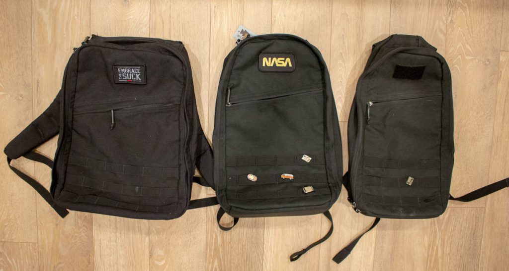
Or, another title could be, my quest for my perfect backpack. For quite a few years I’ve tried backpacks of all types. It’s a funny hobby for me to research different backpacks and see what makes the most sense for me.
I wrote previously about a trip I took with the Bullet 10L (shown at top right), and how well that worked. The downside of that, is on that trip (and several others) I often ended up with the backpack and a tote bag to carry the extra stuff I needed.
When I’ve taken the GR1 (shown at top left), it fits more stuff, but generally just feels more hefty and oversized for day trips and such.
When GORUCK announced a 15L last Fall, I was quite excited! It wasn’t till March that they finally came out in the black color, and that’s when I knew I’d need to give it a shot.
I recently upgraded to a 15″ MacBook Pro, and it doesn’t fit in the 10L anymore. I was quite pleased to find that it DOES fit in the 15L, and even slides into the inner pouch. That’s a big win.
So, where do I fall now on backpack choices?
Well, the 10L technically does fit what I need for short trips, but it’s a tight squeeze. I recently read that having an extra 20-25% spare space in your bag at the start of a trip is a safe bet. You’ll probably pick something up on your way, and you don’t want things to be too cramped.
So, if you want to be a one bag person, and you find something like the 21L GR1 too big (or heavy), then I’d recommend giving the 15L a try. It’s the same height as the 10L bullet, and the GR1, but its width is right in the middle.
In addition, it has a better handle on top than the older 10L (I think they’ve now fixed that in new versions).
I still love the 10L, but will be excited to see how the slightly bigger version does on my next trip.
I’m just a few weeks into a new job, and I have a few observations I want to share. I’ve been inspired by a new book, It Doesn’t Have to be Crazy at Work. This book, combined with Deep Work, has encouraged me to explore ways to focus and get things done, without tons of unnecessary distractions. At Automattic I’ve noticed a few things that are positive indicators for my ability to focus on the things that really matter.
Async over live – I’m seeing a tendency expecting that responses and decisions will get made asynchronously. That gives everyone, regardless of timezone, time to spend a few hours (and maybe days) looking things over and responding when they have time to focus.
Longer time horizons for work – When you can measure your project goals over quarters and years, as opposed to days and weeks, you open up the opportunity for your team to think about the greater needs of your customers. You need balance of course, you usually can’t take 4 years to focus on shipping a product. When teams and individuals make decisions based on longer time ranges, they can often be more calm and thoughtful.
Those two factors help encourage time to think and focus. I love that, and I’m looking forward to seeing what the next few months bring as I get to dig into some projects here.
Tomorrow I’ll be starting a new job at Automattic as a Product Designer. I’m both excited and reflective as I think about what’s ahead in 2019 and beyond.
For the past 3 1/2 years I’ve worked full-time at XWP. I started as a Team Lead, then brought the role of Product Owner (while learning it along the way) to the company in 2016. For the past two years I’ve led the company in bringing user experience design and product design to the projects we took on.
I’ve been able to work with some amazing teams in the enterprise WordPress space as a part of XWP. This has included working with Google on the AMP plugin for WordPress, as well as AMP Stories, working with Beachbody on Demand to help build a new CMS experience for their editorial team, and some amazing engagements with clients such as PMC, News Corp Australia, and more. I’m thankful for the whole team at XWP and the great times!
At the same time I’ve also been able to contribute to the WordPress project (thanks in part to XWP supporting my time), co-leading the 4.9.8 point release of WordPress, speaking at a number of WordCamps, supporting where I could on Gutenberg and other projects, and becoming a Team Rep for the design team.
During this time I’ve been at a completely distributed company. I live in Northern Idaho. My wife and I have two little children, and we’ve been able to live our lives in a way that maximizes time spent with friends and family. Since my daughter was born (she’s almost two years old) I’ve been able to spend so much time with her and watch her grow. That’s a gift and one I’m so thankful to have a job that’s allowed me to do.
Now, I’ve decided to take the next step and move more into Product Design in a way where I can focus on learning and working on projects at scale. The folks at Automattic have been amazing to work with so far (everyone who joins the team has to take a trial project), and I’ll have opportunity to learn alongside an amazing team of designers and developers.
Over the past few years I’ve been privileged to work with some amazing designers and engineers! When you can bring design and engineering together in a true partnership, great things can happen. If either of them are treated as second class citizens, you’ll fall into deep ditches that can sink teams and companies.
“Without a person at or near the helm who thoroughly understands the principles and elements of design, a company eventually runs out of reasons for design decisions. Without conviction doubt creeps in, instincts fail. When a company is filled with engineers it turns to engineering to solve problems, reduce each decision to a simple logic problem, remove all subjectivity and just look at the data. Data in your favor? Ok, launch it. Data shows negative effects? Back to the drawing board. And that data eventually becomes a crutch for every decision.” – Creative Selection
Since January 2017 I’ve been an iPad Pro user. For a short period I even made it my primary computer.
It’s become one of the most important tools I have as a Product Designer. Each week I use it to create sketches during the research and conceptual stages of a project.
There are some situations where my MacBook Pro is better as a tool, and other times I prefer my iPhone or iPad.
I’ve tried the 9.7″, 10.5″, 11″, and 12.9″ iPads. Each time I return to the largest screen size. Anything smaller doesn’t work for me. Mainly I choose the bigger screen because I don’t have to zoom in and out of the paper when I’m sketching. Having a larger canvas helps me spend more time concepting and designing.
Following are the reasons I love my iPad.
As a sketching device
Before owning an iPad I sketched a lot with paper and pen. Now I have a digital piece of paper with copy+paste, as well as resize and layering.
This doesn’t mean paper and pen are obsolete. There are still times I need to step away from all electronics and scribble away on paper.
I’ve tried nearly all sketching and drawing apps for the iPad. Linea Sketch is the best for what I need. It has layering, resizing, copy and paste, snapping lines, grids, and simple drawing tools.
Once watercolor becomes a feature I’ll be in love.
As a reading device
This is one area where a smaller iPad is better. I don’t spend large amounts of time reading on this screen, think articles versus books. Anything less than about 15 minutes works well here. If I want to read an interesting article or Google Doc I’ll often open the link on my iPad instead of my MacBook Pro.
This actually helps break up my day! Getting to read on the iPad means I can lean back for a bit and pull away from my desk.
As a notation device
It almost feels like cheating when I use the iPad to redline a document or article. Since I work remotely we pass a lot of Google Docs back and forth between the team. When I’m reviewing something for a colleague I’ll save it as a PDF and open it in Notability. From there I’ll pull out my Apple Pencil and scribble across the document with red lines and notes.
Writing comments with a keyboard in Google docs is fast. But there are times when I want to think through something and write my thoughts by hand. This is where it it’s fun for me. I can again lean back (there’s a theme here) and absorb what’s on the page, giving feedback as I go.
As a consumption device
The iPad is my favorite way to watch videos. Watching on TV is too much hassle, watching on my phone is too small, and watching on my laptop is overkill.
When I’m watching a video for work (or for fun) I like to prop it up on the iPad and play it on my desk or lap.
As a gaming device
Long gone are the days of PC gaming. At least for now. As for console games, I own a SNES Classic.
In the evenings I love propping my iPad up on a pillow, sitting on my couch, and playing a game. Right now I’m enjoy PUBG Mobile. The experience on a 12.9″ screen is perfect.
WordPress 5.0 has finally launched. It’s been a long time coming, and provides a huge update and change to how the editor works in WordPress. I was privileged to be able to contribute to this release, spending several months in 2017 contributing to design ideas and concepts for early work on Gutenberg.
Earlier this week I decided to try and build a one page site using Gutenberg. I’d played around with blocks, created pages, played with sites, etc. However, I wanted to rely completely on a block interface to build out a complex page.
The journey wasn’t an easy one. I tried out a bunch of the block plugins available.
Will plan to followup when I’ve found a good solution.
The short of all this is I’m looking forward to helping in Phase 2 of Gutenberg, as we try to improve on what’s available and make block building more robust for the future.
In 2016 our team at XWP was able to work with the Beachbody on Demand folks to create a new editorial workflow for the content creation staff. You can read the case study to learn about the work that was done.
During this process I was covering the role of Product Owner for our team, as well as contributing UI/UX support to the editorial workflow.
Since the content staff needed the ability to upload content regularly, and had a specific flow to how content would be added, we used the Customizer in WordPress to make previewing and saving drafts easier as part of this process.
Following are a few interfaces to highlight the work I contributed to throughout the project.
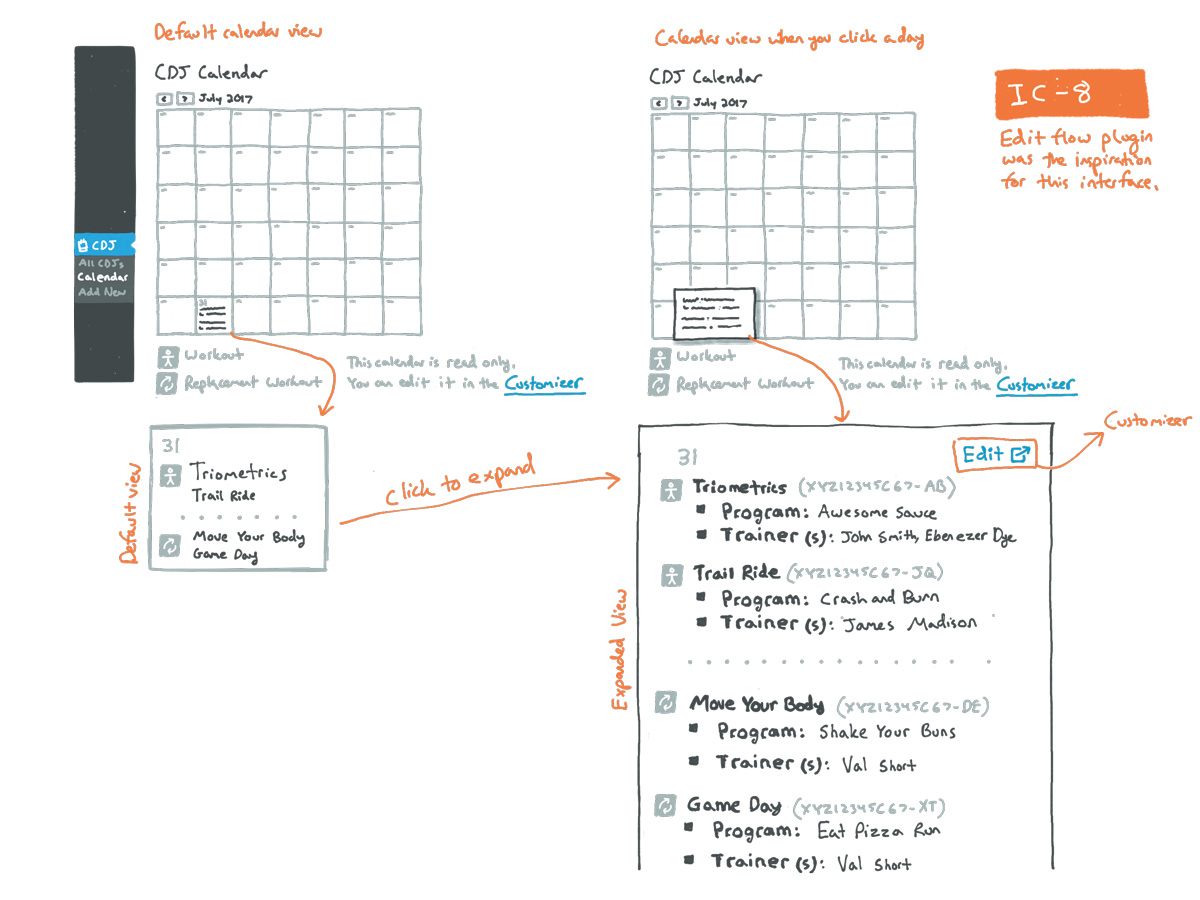
Editorial calendar
Along with the regular programming that gets created for new shows, the team also needed the ability to share training sessions on a per day basis, using a calendar within WordPress. I worked with our team to create concepts and interface ideas that would allow for creating the editorial flow.
Localization
We discussed ways to allow for quick translation and localization of the work that happened. In this case the team needed to be able to translate strings of text and have them show in French and English. Following is a clickable prototype showing a proposal for adding strings in multiple languages.
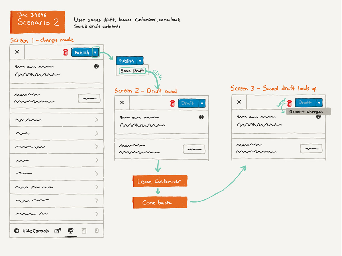
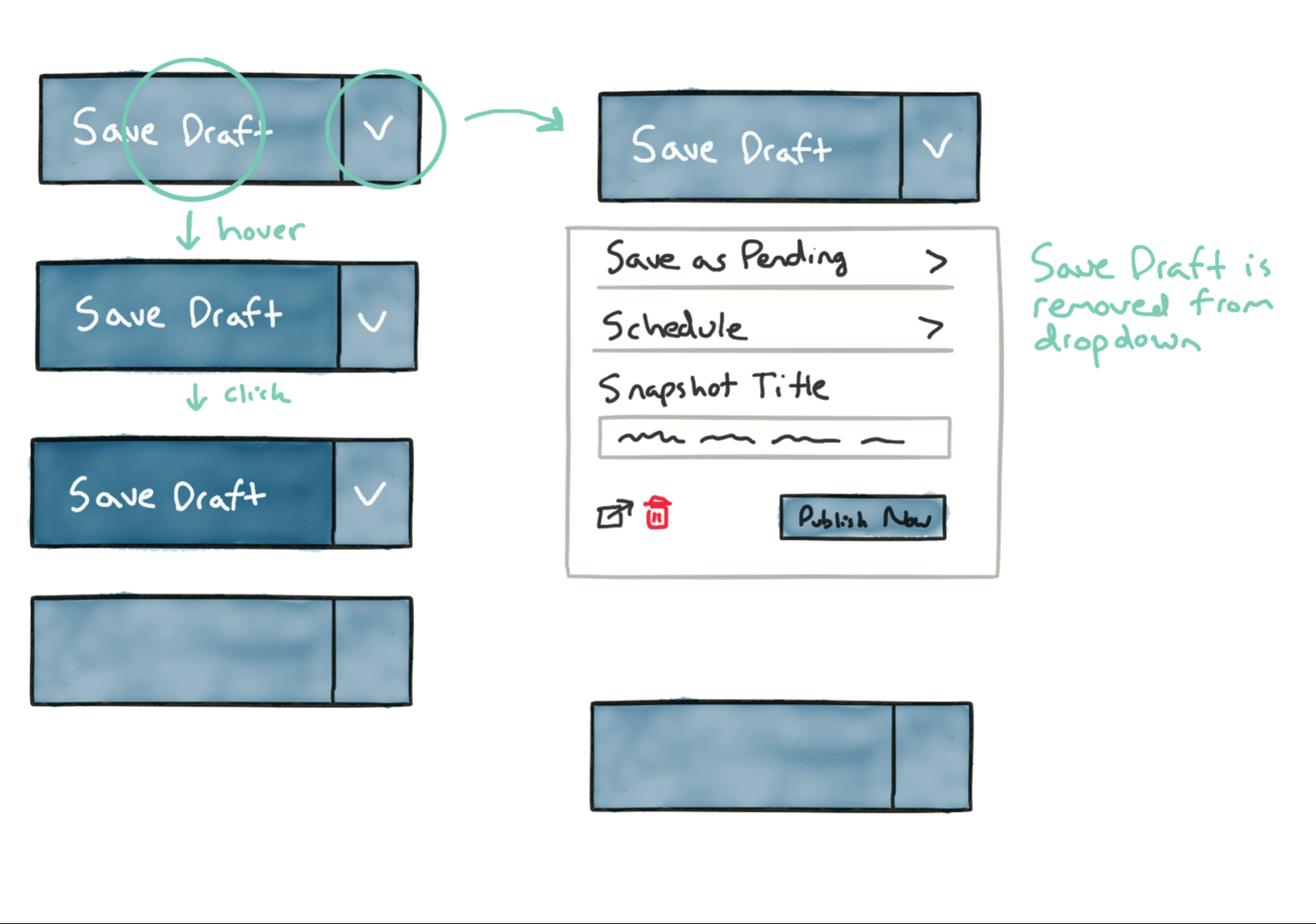
This was such an eye opening feature for me. Several of my team members were discussing the the need to save drafts in the Customizer. I got pulled in and was able to lend UI/UX support to the project.
Over the course of about six months we worked on the issue. I learned a lot about the needs of an open source project, and the importance of understanding the priorities you’re working with. It’s a lot different than simply having a single stakeholder that you’re trying to design for.
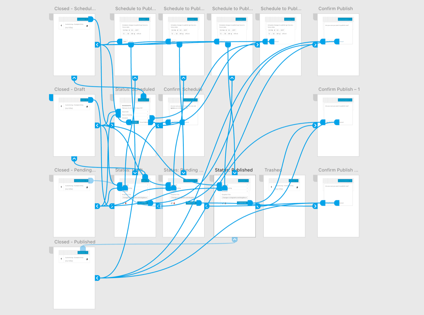
Following are some of my sketches (just a few, there’s more!) showing the process we went through to try and create an elegant solution.
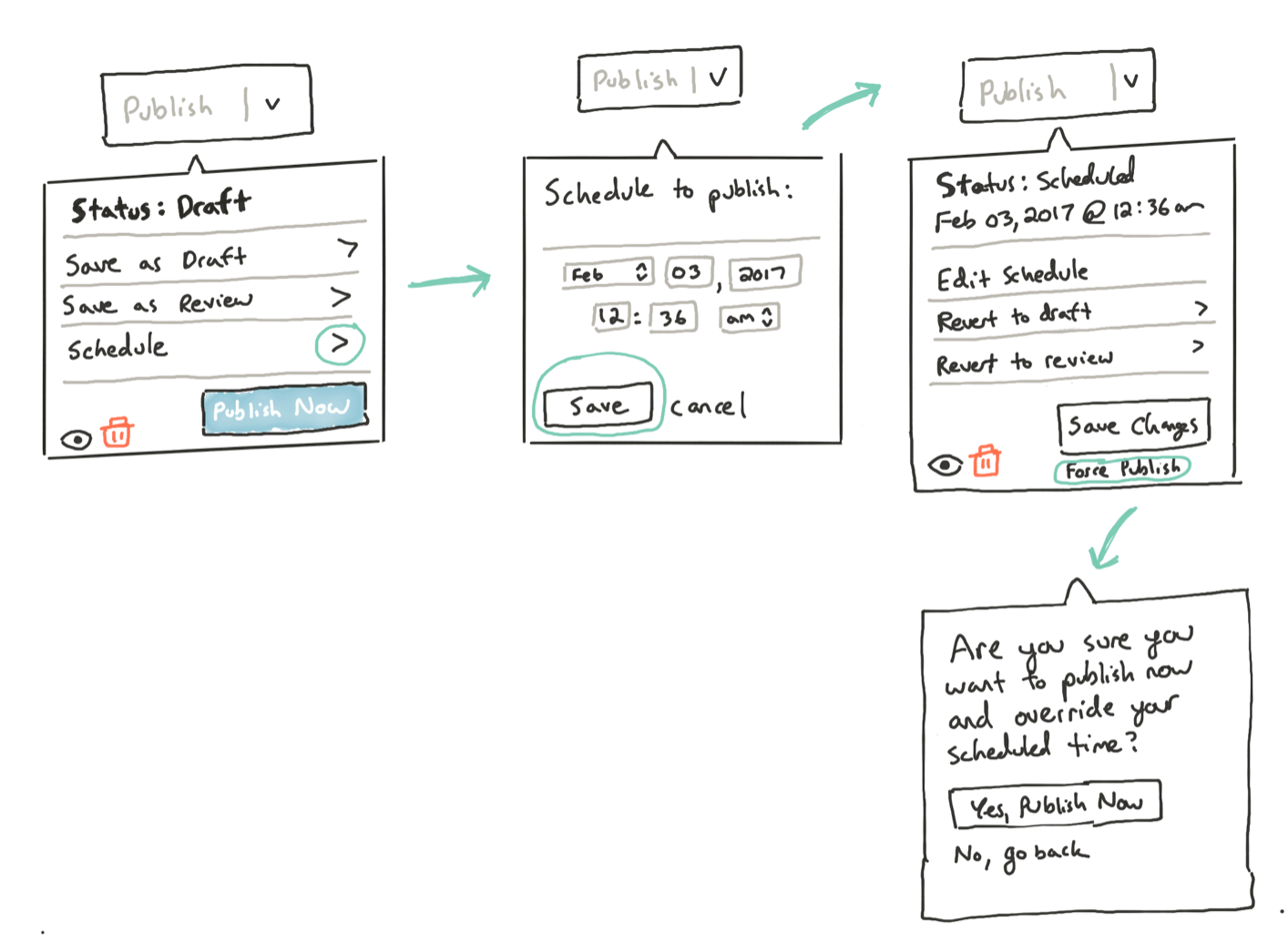
The project started for me when my teammate reached out with a sketch, proposing some initial ideas for where we could take the flow for saving and publishing. We hopped on a call together and talked through this flow. From there I created a sketch to followup and simplify my understanding of the interface.
This served as the launching point for several further iterations and discussions. The benefit of creating a simple sketch like this, as opposed to a finish prototype, is we could think through problems and have discussions before introducing a ton of extra time into finessing the interface.
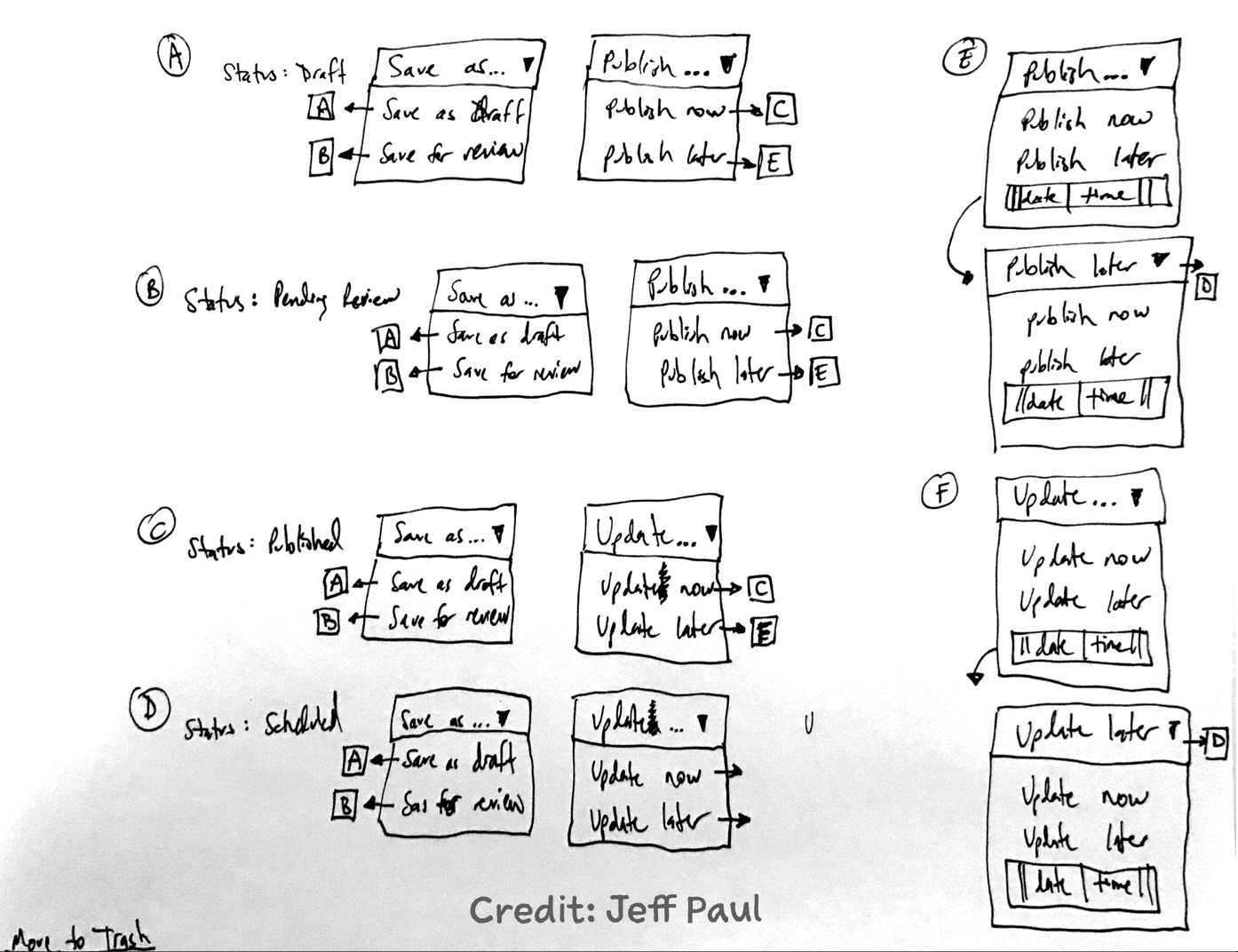
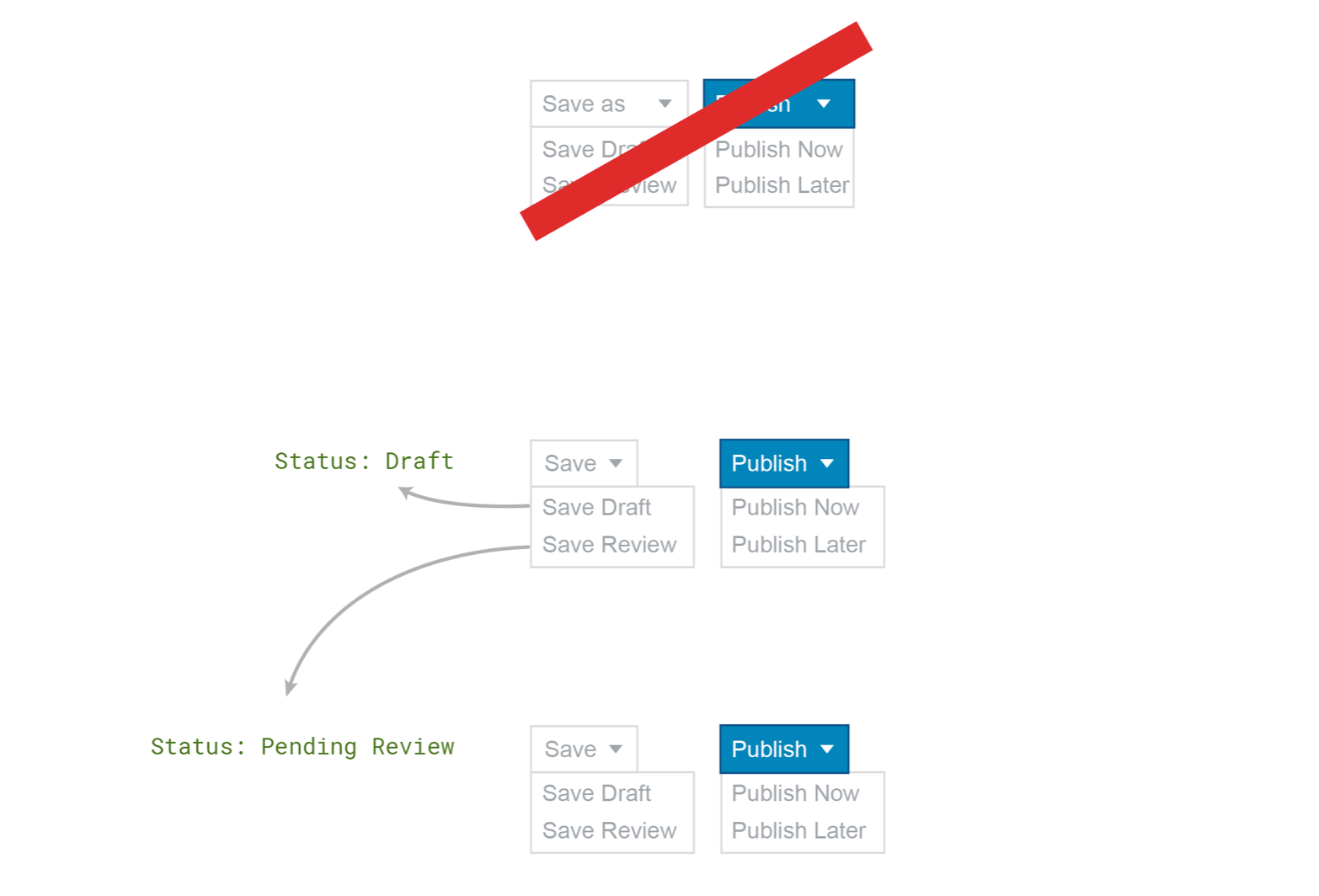
From there I kept playing with ideas, based on feedback from the team, with attempts to simplify things and make sure that the flow made sense for a user trying to manage the status of a post.
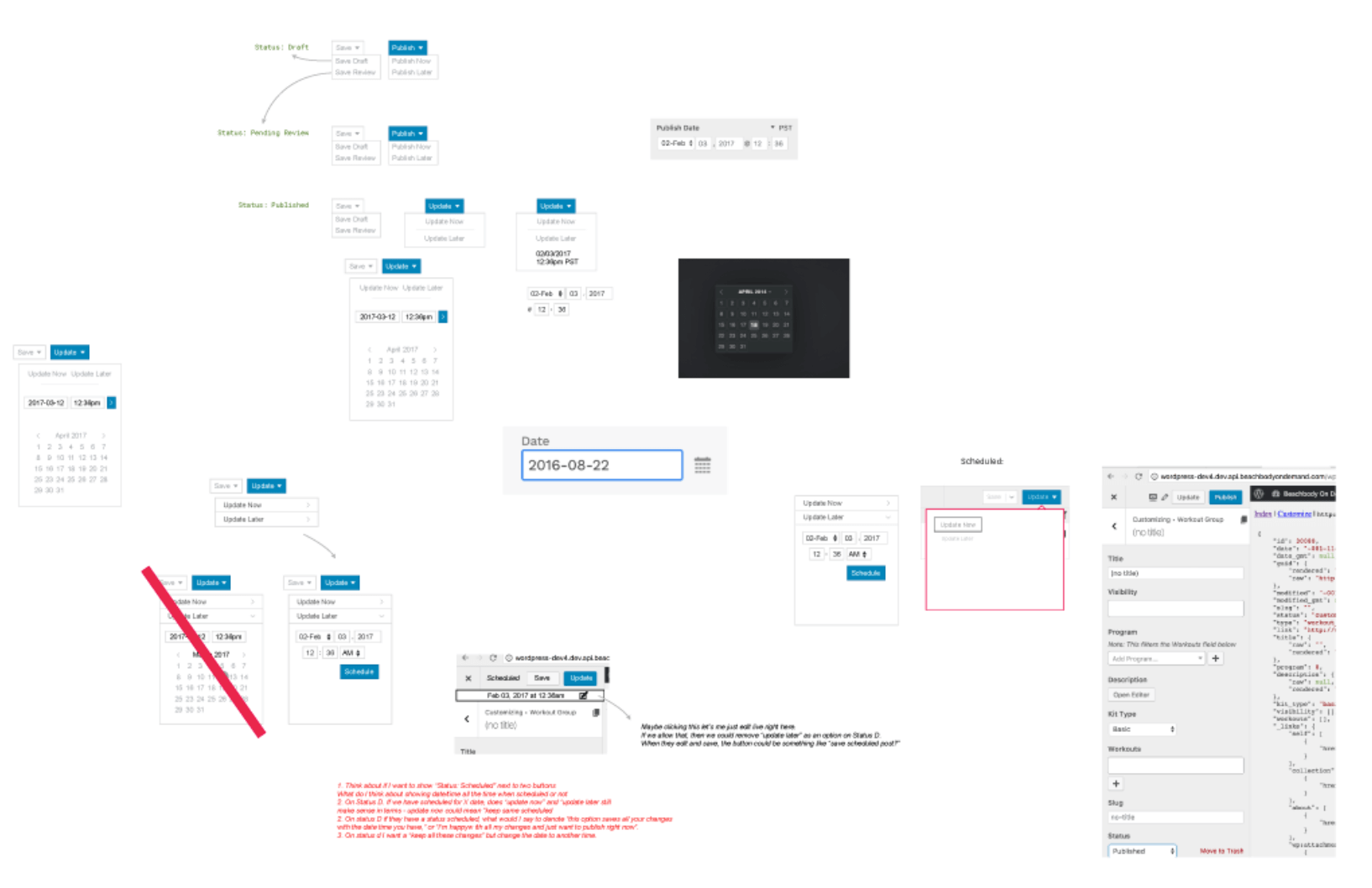
The process got messy, as the above diagram shows. We played with a lot of ideas, and ended up scrapping most of them.
I began to create some flow diagrams to show how each part of the interface would connect with other parts.
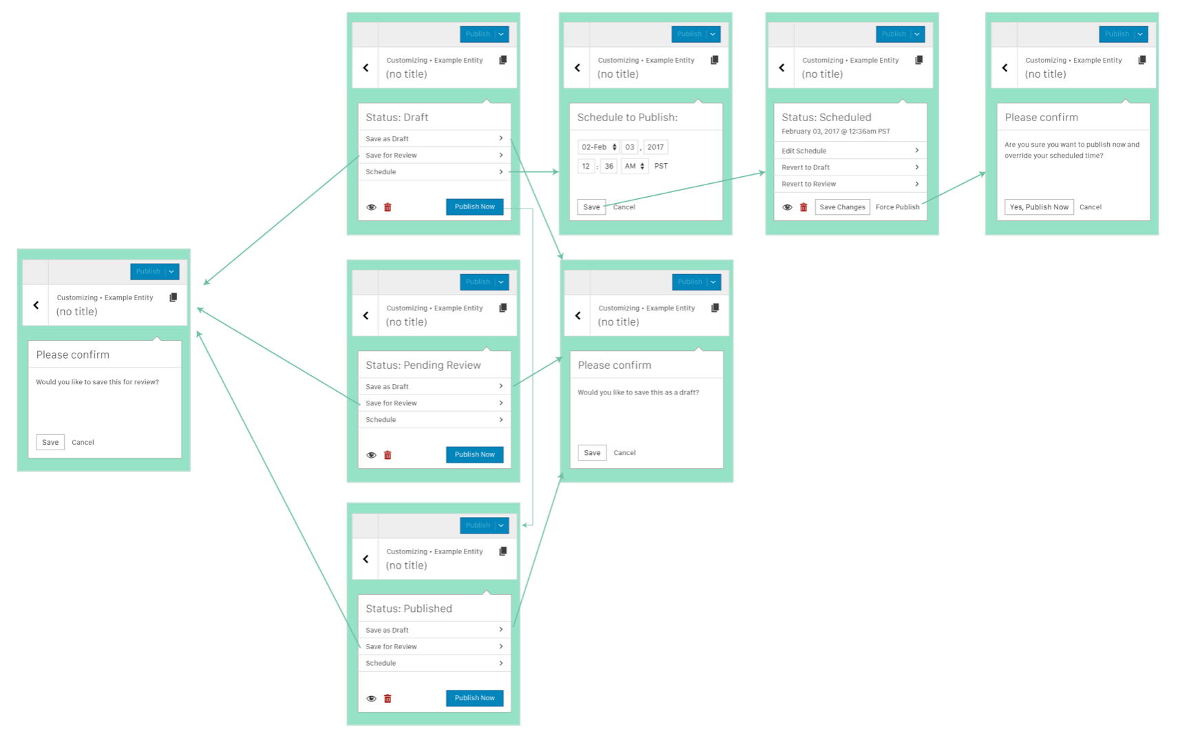
Finally I shared an Adobe XD prototype (diagram above) with the whole interface worked out. We thought we were in a good place with this.
Until we received some feedback on needing to simplify things again. So, I went back to the drawing board. It’s critical to recognize in any project the need for returning to lower fidelity when confusion arises, or rapid changes are needed.
After this point I needed to return to client projects, so several of the Core team were able to improve the work here and push the project across the finish line. You can see the final work in the Customizer today within WordPress.
I spoke about this at WordCamp Seattle 2018, but I wanted to dive into a short post to talk about some of the contributions I’ve been able to make.
Since 2016 I’ve been involved in one way or another, helping out in a number of issues related to the WordPress admin experience.
Here’s the thing, you don’t need to be a developer to make a huge impact on this project. As a designer I’ve been able to help out on a number of issues and make a small impact on the project by being willing to jump in where needed. A few ways I’ve been able to help:
Gutenberg – Starting in 2017 I was able to jump into some issues in Gutenberg and start giving UX feedback and support. I wrote about my initial experience.
Lead support – I’m currently a Design Team Rep and recently Co-led the WordPress 4.9.8 release
Speaking – I’ve been privileged to speak at a number of WordCamps
There are so many ways to help out. These are just a few. The sky is the limit.
On November 11, 2018 I was able to speak at WordCamp Seattle on my experience contributing to WordPress Core as a non-developer. In 2017 I wrote about my initial experience, and now now I’ll be planning to expand on what’s happened since.
Let me tell you, it’s been an amazing ride! For years I’d had interest in helping out in the open source community and supporting the making of WordPress, but I wasn’t sure how to get started. That initial article highlighted the start of my journey.
Since then I’ve been able to help out across a few projects and make a different where I can providing design feedback and at times jumping in to do design work.
I shared my experience to encourage others to get involved. There are folks from all kinds of backgrounds with wonderful expertise that they could offer to open source projects. A lot of times it takes a little encouragement to figure out how to get started.
Jonas Downey, from Basecamp, shared an article this morning about his experience in creative work. I agree 100%. You can read his full article, which I highly recommend.
“Start thinking about productivity in terms of quality time instead of clock time. You might end up making the same progress with only 20 energetic hours that you would have made in 60 tired hours.”
In creative work I’ve found that 2-4 good hours is far more valuable than 8-12, if it’s the right time of day, and if you can set aside uninterrupted time for deep work.
“When you’re tired, distracted, or in the weeds on something, it’s usually better to stop working. Just admit (temporary) defeat and give yourself a chance to regroup. Do something else that’s less taxing, or call it quits and start again later.”
Agree 100%. Pushing through and slogging is much different than breaking through when you’re in the flow.
When you enjoy your work there can be a natural bent towards encouraging it to become all absorbing. This can also happen if things are going very wrong at work.
Last week I was really inspired by a book from the guys at Basecamp. This, along with the writings of Cal Newport, has given me the head knowledge to recognize the need for setting boundaries in my work and my life. However, an intellectual acceptance of something, and even at times wholehearted actions to take things in that direction, isn’t always enough. It’s easy to get busy, to get into your work and not come up for air.
Over the past two weeks I’ve gone back to practicing a separation. On Friday afternoon I stop my work, and I don’t check email or Slack until Monday morning. In addition, each afternoon after work I turn off Slack and email (notifications especially, I don’t have those anymore) and don’t check until morning. If previous attempts at this are any indication, the most likely culprit for falling back into previous patterns is an upcoming event or deadline.
My goal is to see if I can identify the things that trip me up and work to prevent them. If I’m able to stop thinking about work when I’m away from it, I can focus on other things I care about; leaving me fresh and ready to tackle work again the next morning.
A few months ago our team at XWP was tasked with the challenge of building AMP Stories in WordPress. We began working with the team at Google to come up with an initial minimum viable product.
Following are some of my messy sketches showing our process and what it took to move from the initial idea to a released product. I find sharing the process is as important as the final product as it shows the thought and deliberation that went into it, and helps open up discussions for further improvements.
The project
We didn’t have an unlimited period of time to work on it, so we knew we’d have to work quickly to try out some ideas and create a shippable beta for sharing with users and stakeholders.
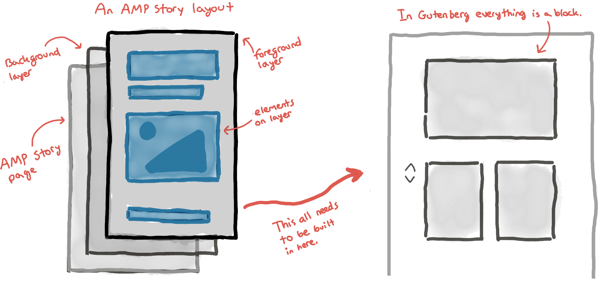
AMP Stories are a mobile format for sharing articles and content in a tappable way. They’re similar to how Instagram Stories function. The idea with bringing this format to WordPress is anyone using the AMP for WordPress plugin would be able to create their own stories without needing to code a custom solution.
At the start of the project it made the most sense to build the interface for AMP Stories using Gutenberg, a soon-to-be-released editor for WordPress. This gave us the opportunity to work with a new editor and pave the way for experiences that could improve Gutenberg as a whole.
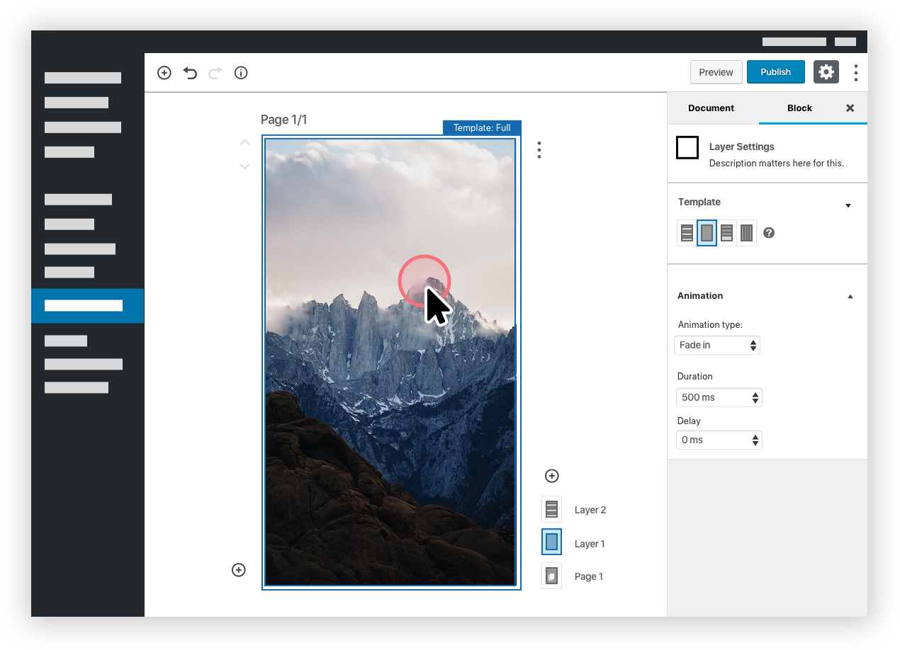
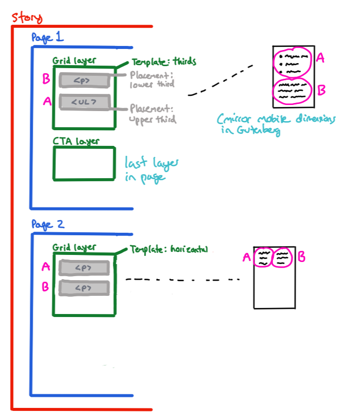
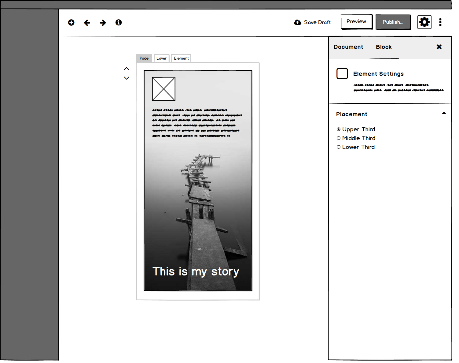
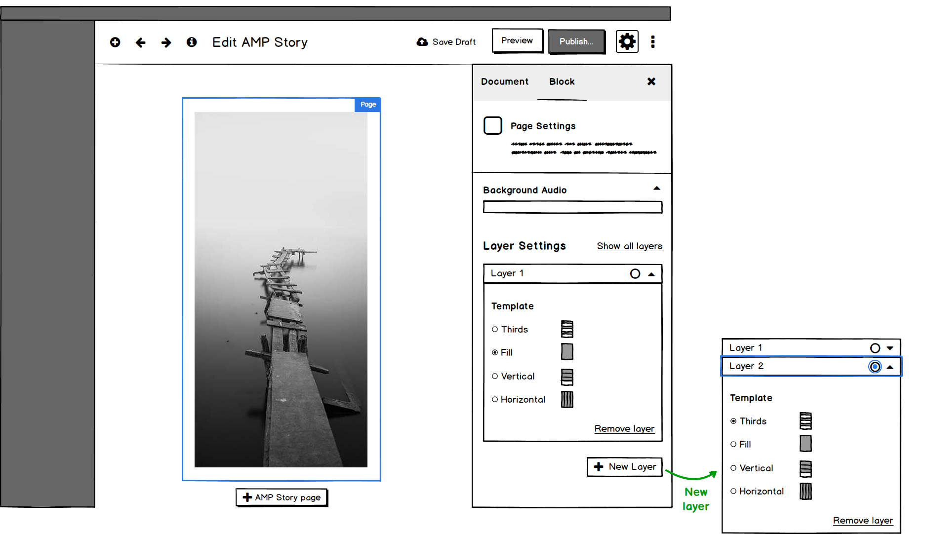
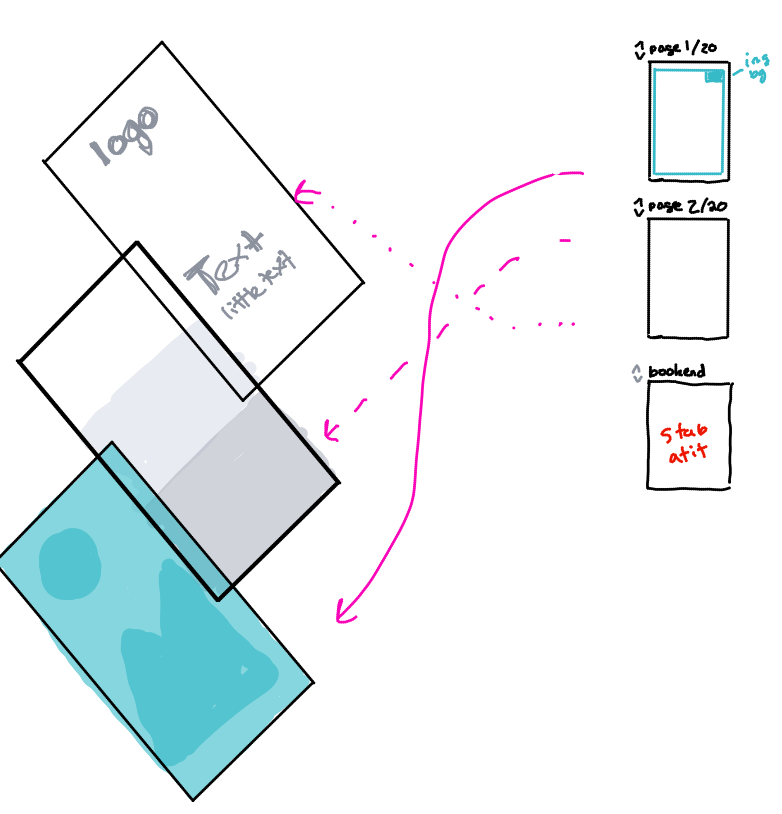
My role on the project was to design the user experience. I worked closely with several of our team as we all brainstormed and looked at ways to make this happen. The initial problem was around AMP Stories themselves. At its most basic an AMP Story has several parts to it:
A bunch of pages
Layers inside each page
Elements inside each layer
An AMP Story can be as few as one page, and could easily number 10-50 pages. We needed to somehow match that to the block interface in Gutenberg.
Initially this felt right, like it should work. However, we weren’t quite sure how easy it would be for someone to build a story using this editor. We also didn’t want to introduce unnecessary complications for users.
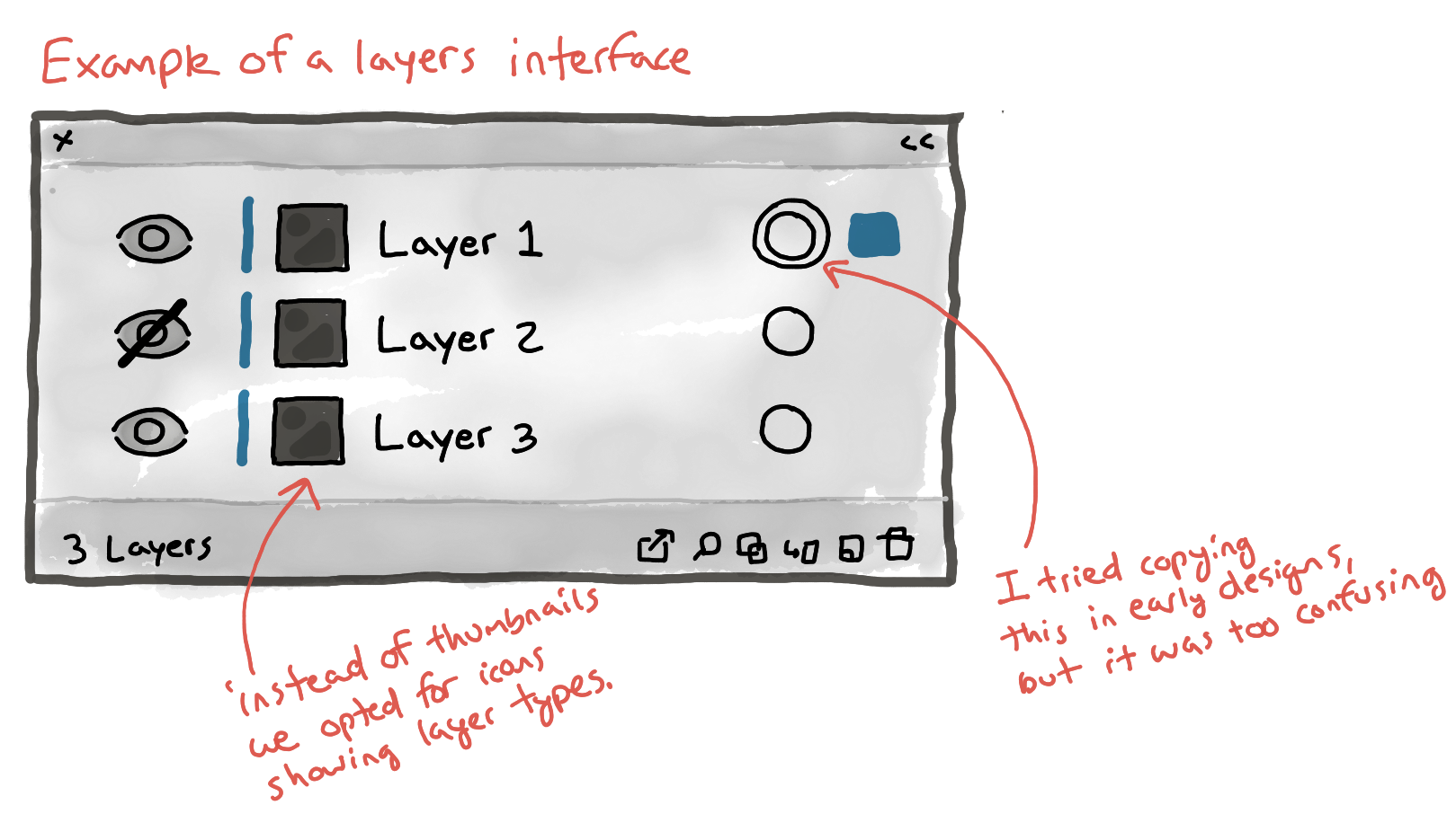
If you’ve ever used a program that has layers built in, such as Adobe Photoshop or Sketch, you’ll be familiar with the concept of hiding and showing layers in a way that allows you to manipulate content. Below is a sketch showing the elements that might normally be shown in a layers palette.
We knew we’d need to make sure it wasn’t too complicated to edit pieces of one layer without overwhelming users with things on other layers.
With this idea of trying to match all the parts of an AMP Story to the available parts in WordPress, I began sketching ideas for the interface in collaboration with the rest of our team. Products like this often require lots of iteration before we can settle on a solution.
So, I tried out a bunch of ideas.
The process
If you follow the initial conversation on Github, you’ll see that we started by wrestling with the concept of the story, the pages within the story, the layers, and elements in the layers. This first sketch, color coded accordingly, attempts to figure out what that interface could look like.
And here is another sketch thinking through that concept further. Please note that for the sake of brevity I’m skipping a few things.
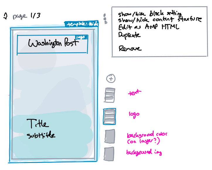
From the first few sketches and ensuing conversations I was feeling like I had figured out the problem, and was itching to go from simple sketches into a more complete design (using Balsamiq wireframes).
As I’ve shared before, this is ok to do, but be cautious! The moment you go from a simple form of visual sketching into something that’s more detailed there’s some risk. This is called going from low fidelity to medium fidelity (and then eventually to high fidelity). The problem is you’ll sometimes get so stuck in something you’ve spent hours building that it’s hard to scrap it if things are going wrong.
I was thinking that the layers and blocks could fit into a tab interface right on top of the story. That sounded right in principle, but in reality it didn’t make sense when I shared it with the team.
I tried some other ideas, and we also agreed that pages shouldn’t be in a tab, instead they should just go down the page as linear blocks; reducing one extra user element, that’s good!
Well, after chatting with the team we realized this wouldn’t make sense, it was still too complex. I even created a bunch of screens and showed a video walkthrough of the user journey. It wasn’t working. So I went back to simple sketches again.
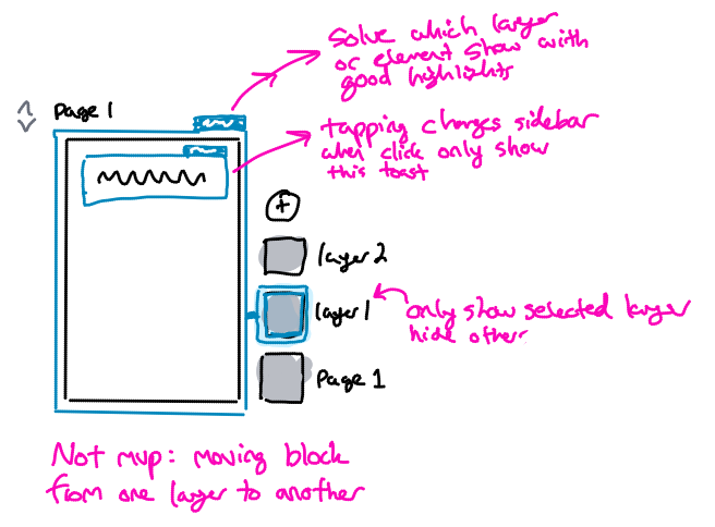
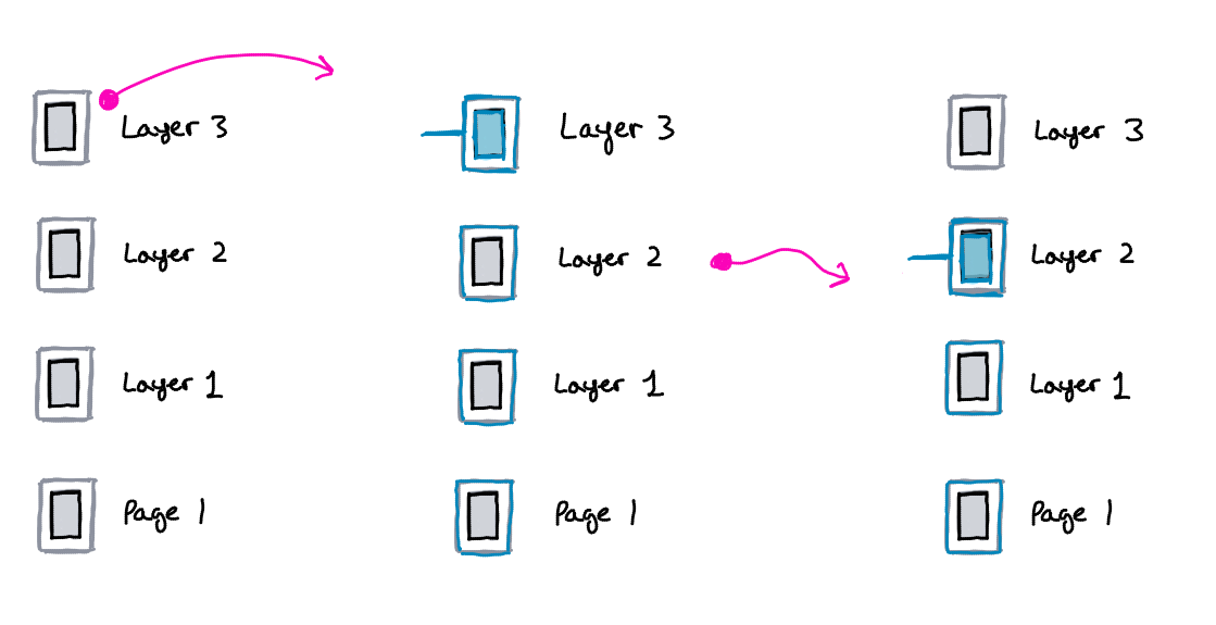
This is where we landed on a concept that made it into the final product. We knew we wanted a way for users to be able to select different layers and elements, and knew it’d be important to make that visually simple, so we added small layer cards next to each page. Viola!
We had further discussions to make sure we were on the right page, and decided we were headed in the right direction.
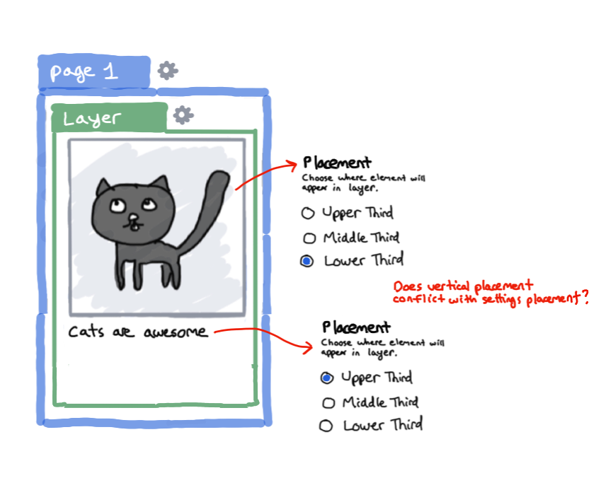
We started getting the idea of the layer cards a little bit more fleshed out. One design element I hoped to simplify with the card icons was the types of layers. Since a page can have several different layer types (fill, thirds, vertical, horizontal) I wanted to create different icons for each one.
At one point we had a discussion to make sure the selectability of the layer cards made sense. I sketched out the various selected states. Our idea was that if a bottom layer was selected all layers and elements above that layer should be hidden, to allow for easier editing.
That was a good idea, but we needed to make sure the layer cards helped with showing which layer was active.
We finally landed on an idea that felt right, didn’t get overly complex, and was worth building out for real world testing.
I then took the rough sketches and created a prototype and user journey for creating a basic AMP story.
From there our team was able to develop this into a beta feature for the WordPress for AMP plugin with Gutenberg as the platform. You can also view a clickable prototype of the work in Adobe XD.
Conclusion
This was a wonderful project to work on. The team was great to work with and we created a useful MVP within a short period of time. The work was built using our own expertise, best practices in UX in WordPress, as well as feedback from a handful of folks.
Projects like this are always challenging and fun and offer opportunity to figure out the best thing to build with as simple of a user experience as possible.
If you’re curious and want to try it out you can download the latest version, keep an eye on XWP’s blog for an updated post.
Tomorrow I’ll be turning 31. Instead of writing about being 30 at the start of the year, I want to share my thoughts on the last day of it.
I could speak directly to experiences in my life (I’ve had many wonderful ones!), things I’m thankful for (the list is long), or people who mean something to me (close connections have made me who I am). Instead of that, I want to touch on a few points today that have impacted me deeply:
Comparing yourself to others – It’s easy for me to look at others and compare myself to them. I could use another’s station in life to mentally push them down in order to lift myself up. I could look with jealousy at someone who, from my viewpoint, has it better. All of that is pointless, and damaging to relationships and my sense of self. Instead, my goal is to strive to be the best version of who I’m meant to be. If there’s to be any comparisons made, it should be between where I’ve come from and where I intend to go. My journey isn’t the same as anyone else’s, and to create comparisons isn’t healthy or accurate.
Leadership qualities – For me leadership has been an interesting thing to discuss and an odd ideal to pursue. We can talk about servant leadership, micromanaging bosses, or absent managers. In my experience a little book, “Turn the Ship Around!”, has been one of the best pieces of advice on the topic. A true leader looks to create leaders that think one level higher than their rank (in a naval context). Instill in others autonomy and guidance to make their own decisions, then back them up or gently steer them in the right direction.
Striving in your career – Without vision you won’t go anywhere. There’s an interesting point between going all in on an idea, fully invested, versus not caring or simply holding back. Over the past year I’ve seen opportunity to push the boundaries on things I’ve believed in. The results, while not what I expected, have still brought about answers that can move things forward. The takeaway for me then is: in the work you pursue strive to do something worth doing, go big, be daring. However, in the doing, don’t invest all of your being into that work, keep a part set aside for your outside of work life.
This life is a special one that we’re given. I want to use it to build relationships that matter, and help lift others up.